Code
the_day[which(the_day$type == "NumberOfTimesFallen"),] |>
select(type, local_start, local_end) |> gt()| type | local_start | local_end |
|---|---|---|
| NumberOfTimesFallen | 2021-10-13 14:08:21 | 2021-10-13 14:08:21 |
Exploring an example of fall detection via the Apple Watch and interpreting the event via details from the Apple Health Export.
This post will explore an example of the Apple Watch doing fall detection.
For that, we need a fall.
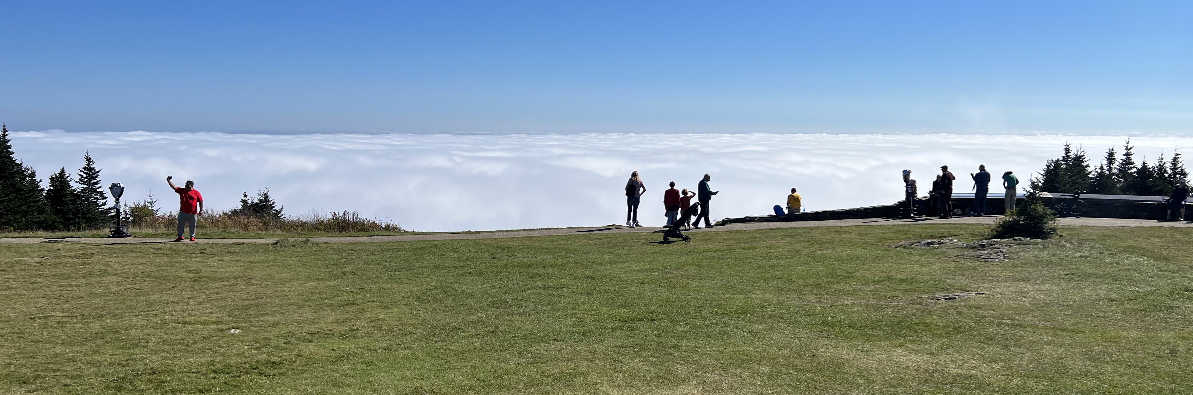
In October 2021, I did a hike to the top of Mount Greylock, the highest point in Massachusetts. I stayed overnight at a nearby ski lodge and did the hike the next day. I parked about halfway up just south of Jones Nose. The walk to the summit was about 4.5 miles. On the way up I encountered another elderly hiker coming down. He said that he had walked to the top of Mount Greylock many times and never seen anything like that day. He told me that I was in for a treat.
When I got to the top I saw what he meant. Beyond the point where I arrived, there was a sea of clouds lapping up against the summit. It seemed as though one could walk down the meadow and just walk out onto the clouds.
I had lunch at the Bascom Lodge and then started on my walk back down to where I had left my car. I planned a scenic route that I expected would be about six miles.
I walked down almost a mile on the Overlook Trail. The surface had a lot of loose stones, almost as though at times it was a stream bed.
Now my tale becomes more uncertain. I remember being on the trail, but the next thing I remember clearly was my watch vibrating to get my attention with the message “You appear to have taken a hard fall. Are you OK?” It took me a moment to realize that I had in fact fallen, even though I had no memory of the fall. I told the watch I was OK and then tried to collect myself. I was a bit disoriented. Although I didn’t remember the fall, I did have a dream-like memory of walking on the trail. It was exactly the sensation of waking from a dream and not being sure whether the dream was real or a dream. In this case, it seemed like a dream, but it actually must have been real.
My hat was gone so I made a half-hearted attempt to head back the way I came to look for my hat. I gave up on that fairly quickly and headed down the trail and very quickly came to the Notch Road, an auto road that goes to the summit. At this point I realized I had a small amount of blood on my face. I started walking steeply downhill on the Overlook Trail in the direction of my car. At that point I was probably four or five miles away from my car.
After going down a couple of hundred yards I realized I was not quite myself. I knew that the fact that I couldn’t remember the fall meant that I might have a concussion. It was the middle of the week and the trail was very lonely, and I began to feel that perhaps walking several miles to my car was not a good idea. So I turned around and headed back up to the road. Unfortunately that was a steep climb and that short hike back up to the road really stressed me out.
After I got to the road I think I made a second unsuccessful attempt to find my hat and then planned to flag down a car for a ride. The speed limit on the road is 25 mph, and the first car that came along stopped for me immediately and took me to my car. I drove to the ranger station where they gave me directions to the hospital in Pittsfield, about 15 minutes away. I spent quite a few hours in the ER while they checked an MRI of my head and did a couple of stitches inside my lip. They kept me for observation overnight, and then I drove home to Connecticut the next day. As with my other ER visits in this Apple Watch tour of emergency rooms, medically this visit was not a big deal.
I should emphasize that because I was by myself it was very helpful that my Watch told me I had fallen. I honestly wonder how long it would have taken me to realize that something had happened to me. I would have wiped some blood from my brow and wondered where that came from. And then I might have wondered where my hat was. So the fall notification was helpful in a way I wouldn’t have anticipated. It made me aware more quickly what had occurred which probably made it easier for me to decide how to respond.
As with my earlier visits to an ER, after I got home I wondered what happened to me, and the natural thing for me to do was to dig into my Watch data to see what I could find out. I still remembered nothing of the fall and I was a bit cloudy about the period after the fall as well.
This happened a year ago so I’m not doing this exercise to get any medical information about my fall. This is purely a matter of curiosity about what happened, curiosity about how much information I can squeeze out of the Apple Health Export, and an opportunity to practice my R skills and use Quarto to write a blog post.
One question I was interested in was whether I had actually been unconscious. (Spoiler alert: I probably was not unconscious, at least not for more than a few seconds.)
Let’s dig into the data.
I was recording an Apple workout on my watch during the hike. The watch takes measurements much more frequently during a workout than it does normally. In fact, it records some measurements every two or three seconds.
I loaded the Apple Health Export into R as I have done previously.
I looked for the key line in the data where type is NumberOfTimesFallen.
the_day[which(the_day$type == "NumberOfTimesFallen"),] |>
select(type, local_start, local_end) |> gt()| type | local_start | local_end |
|---|---|---|
| NumberOfTimesFallen | 2021-10-13 14:08:21 | 2021-10-13 14:08:21 |
So 14:08:21 is the time stamp for the fall data. Is that when the fall actually occurred?
We have other data about the timing of the fall: heart rate and motion data. Figure 2 below shows the details of four measurements: heart rate, active energy burned (which is based on movement), speed (based on distance traveled divided by the time period), and elevation (based on the GPS track recorded as part of the workout).
The x-axis is time of day (recorded on a 24-hour clock so 14:00 is 2PM). The time period covered goes from about 1:45 PM to 2:30 PM so it’s a lot of measurements in a relatively short period of time.
Focusing on the heart rate line one can see a sudden jump in the heart rate at about 13:59 (from about 85 to 110). I believe that’s when the fall happened. The time stamp in the export for the fall event is almost ten minutes later because that’s how long it took for me to notice the message and respond that I was OK. To me it also suggests that the time period that seemed to be just a dream may have lasted almost nine minutes or so.
At the same time as the jump in the heart rate there is also a drop in speed and a drop in movement (measured as calories per hour). Although I may have been motionless for a brief period, one can see speed and movement resume at a slower rate shortly after the fall. I’ve marked a vertical green line where it appears I started moving somewhat normally and probably started to look for my hat.
# tip on how to label facet plot with varying axis:
# https://www.statology.org/ggplot-facet-axis-labels/
#create multiple scatter plots using facet_wrap with custom facet labels

# fall item is at 14:08:21
# point by point examination of gpx track:
# #1069   13:59:16 start of pause that goes until
# #1106   13:59:53
# #1121   14:00:08 another possible spot for fall. Maybe when noticed alarm
fall_colour <- brewer.pal(4, "PuOr")[1]
record_colour <-  brewer.pal(4, "PuOr")[4]
second_colour <- brewer.pal(4, "PuOr")[2]
pickedup_colour <-  "lightgreen" #brewer.pal(4, "PuOr")[3]
p_base <- for_plot |>
  filter(local_start > as_datetime("2021-10-13 13:41:14"),
         local_start < as_datetime("2021-10-13 14:32:36"),
         ((type != "DistanceWalkingRunning") | (per_second < 7)),
         type %in% c("ActiveEnergyBurned", "HeartRate", "DistanceWalkingRunning", "Elevation")) |>
  mutate(type = factor(type, levels = c("HeartRate", "DistanceWalkingRunning", "ActiveEnergyBurned","Elevation"))) |>
  ggplot(aes(x = local_start,
             y = per_second)) +
  geom_vline(xintercept = as_datetime(possible_fall), linetype = "dashed", colour = fall_colour) +
  # geom_vline(xintercept = as_datetime(possible_resume), colour = "orange") +
  geom_vline(xintercept = as_datetime(backtrack_for_hat), linetype = "dashed", colour = pickedup_colour) + # back to look for hat
  geom_vline(xintercept = as_datetime(fall_recorded), linetype = "dashed", colour = record_colour) + # fall recorded
  # geom_vline(xintercept = as_datetime(start_downhill)) + # started down hill
  # geom_vline(xintercept = as_datetime(turn_around), colour = fall_colour) + # bottom of hill
  # geom_vline(xintercept = as_datetime(get_ride), linetype = "dotted", colour = pickedup_colour) +
# picked up
  geom_vline(xintercept = as_datetime(ranger_station), colour = "darkgray") +
  geom_vline(xintercept = as_datetime(arrive_ER), colour = "darkgray") +
  xlab("Time of Day")
p <- p_base +
  geom_point(size = 0.1) +
  facet_wrap(vars(type), ncol = 1, scales = "free_y",
             strip.position = 'left',
             labeller = as_labeller(c(HeartRate = "Pulse",
                                      DistanceWalkingRunning = "Speed",
                                      ActiveEnergyBurned = "Cal/Hour",
                                      Elevation = "Feet"))) +
  ylab(NULL) +
  theme(strip.background = element_blank(),
        strip.placement='outside')

p2 <- p + geom_text(data = tribble(
  ~type, ~label,
  "ActiveEnergyBurned", "\nActive Energy",
  "HeartRate", "\nHeart Rate",
  "DistanceWalkingRunning", "\nWalking Speed",
  "Elevation", "\nElevation"
) |>
  mutate(type = factor(type, levels = c("HeartRate", "DistanceWalkingRunning",
                                        "ActiveEnergyBurned", "Elevation")),
         local_start = as_datetime("2021-10-13 13:41:14"),
         per_second = Inf),
mapping = aes(label = label), vjust = 1, hjust = 0, nudge_y = -5,
colour = "gray40", size = 5)
# colorbrewer 4 color purple orange


p2 + geom_text(data =
                 tibble(local_start = c(possible_fall, fall_recorded),
                        type = c("HeartRate", "HeartRate") |>
                          factor(levels = c("HeartRate", "DistanceWalkingRunning",
                                            "ActiveEnergyBurned", "Elevation")),
                        per_second = c(145, 145),
                        label = c("Fall", "Recorded")),
               mapping = aes(label = label, colour = label),
               hjust = 0, vjust = 0.5, nudge_x = 10) +
scale_colour_manual(guide = NULL, values = c(fall_colour, record_colour)) 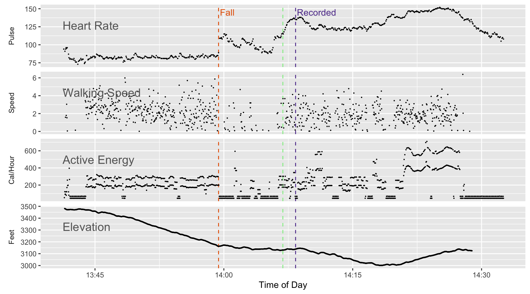
There’s another type of record for this time period: the GPS track of my route during the walk. Figure 3 shows a map with two versions: the GPS trace recorded on my Watch as part of the workout and a separate trace I recorded via a mapping app on my iPhone. You can see where I think the fall occurred and where it was recorded on the Health data.
# track_watch <- st_read("~/Downloads/apple_health_export/workout-routes/route_2021-10-13_12.47pm.gpx", layer = "tracks")
# track_watch <- st_read(paste0("Apple-Health-Data/track_watch.gpx"), layer = "track_points", quiet = TRUE)
# points_df is used to label the key locations
points_list <- c(possible_fall, backtrack_for_hat, fall_recorded, turn_around, seek_ride)
points_df <- tribble(
~time, ~label, ~color, ~icon, ~direction,
possible_fall, "Fall", fall_colour, "sad-outline", "bottom",
backtrack_for_hat, "Hat", pickedup_colour, "hand-left-outline", "bottom",
fall_recorded, "Fall\nRecorded", record_colour, "reader-outline", "right",
turn_around, "Turnaround", pickedup_colour, "hand-left-outline", "top",
seek_ride, "Seek\nRide", pickedup_colour, "hand-left-outline", "bottom",
# car_parked, "Parked\nCar", pickedup_colour, "car-outline", "bottom"
)
points_df <- points_df |>
filter(time %in% c(fall_recorded, turn_around, possible_fall))
# find where a point occurred
get_lat_lng <- function(atrack, atime) {
position <- map_int(atime, function(x) which.min(abs(atrack$time - x)))
tibble(time = atime, lat = atrack$lat[position], lng = atrack$lng[position])
}
points_df <- points_df |>
left_join(get_lat_lng(watch_line_data, points_df$time), by = "time")
# add a point for my parked car
points_df <- points_df |>
bind_rows(
tribble(
~time, ~label, ~color, ~icon, ~lat, ~lng, ~direction,
seek_ride, "Parked\nCar", pickedup_colour, "car-outline",42.601480,-73.200322, "bottom")
)
points_df$time[4] <- NA_real_
# see https://stackoverflow.com/questions/37996143/r-leaflet-zoom-control-level
m <- addPolylines(leaflet(), data=track_phone, color = "green") |>
addScaleBar(position = c("topleft")) |>
setView(lng = -73.16687, lat = 42.64172, zoom = 17)
# m2 <- addPolylines(m, data = track_watch, color = "red")
m2 <- addPolylines(m, lat = watch_line_data$lat,
lng = watch_line_data$lng,
color = "red")
m4 <- addTiles(m2, "https://{s}.tile.thunderforest.com/outdoors/{z}/{x}/{y}.png?apikey=452dc06e5d1947b7b4e893535d0e6b36", group = "Outdoors",
# m4 <- addTiles(m2,
'https://tiles.stadiamaps.com/tiles/outdoors/{z}/{x}/{y}{r}.png',
attribution = '© <a href="https://stadiamaps.com/">Stadia Maps</a>, © <a href="https://openmaptiles.org/">OpenMapTiles</a> © <a href="http://openstreetmap.org">OpenStreetMap</a> contributors',
options = providerTileOptions(minZoom = 12, maxZoom = 20))
# var Stadia_Outdoors = L.tileLayer('https://tiles.stadiamaps.com/tiles/outdoors/{z}/{x}/{y}{r}.png', {
# maxZoom: 20,
# attribution: '© <a href="https://stadiamaps.com/">Stadia Maps</a>, © <a href="https://openmaptiles.org/">OpenMapTiles</a> © <a href="http://openstreetmap.org">OpenStreetMap</a> contributors'
# });
# look for tiles at: http://leaflet-extras.github.io/leaflet-providers/preview/index.html
addMyLabel <- function(map, lat, lng, label, color, direction = "bottom") {
map |>
addLabelOnlyMarkers(
lng = lng,
lat = lat,
label = label,
labelOptions = labelOptions(noHide = T, direction = direction,
style =list(
"color" = color,
"font-family" = "serif",
"font-style" = "italic",
"box-shadow" = "3px 3px rgba(0,0,0,0.25)",
"font-size" = "14px",
"border-color" = "rgba(0,0,0,0.5)"
))
)
}
# This is the first time I've used an explicit loop in a long time!
for (i in 1:4) {
m4 <- m4 |>
addMyLabel(lat = points_df$lat[i],
lng = points_df$lng[i],
label = points_df$label[i],
color = points_df$color[i],
direction = points_df$direction[i])
}
m4If you zoom into the area where the fall was entered into the Health dataset you can see some back and forth on my GPS trace. I think that’s because I was looking for my hat. But where I actually fell was almost 150 feet away from that area. I didn’t know where I lost my hat because I assume I was walking for a bit in a daze and wasn’t fully aware of what was going on. That’s the part that felt like a dream.
My conclusion was that I was not lying on the ground for very long after the fall, but I was dazed for a short time.
I spent some time by the road deciding what to do and then continued walking on the trail toward my car. That took me steeply downhill. I think that during that period I realized that I was not 100%. My heart rate was above 120 (while before the fall my heart rate was below 85 while I was walking down hill). I had second thoughts about walking to the car and turned around and headed back up hill. The hill was quite steep and that’s where my heart rate reached it’s highest point.
I made a good decision to turn around and try to get a ride, but a better decision would have been to do that before I continued down the hill. I took some time to think about what to do, but in retrospect I maybe should have taken even more time.

The Apple Watch will contact 911 and your emergency contact if you are motionless for a minute after the fall. I don’t think it attempted to do that in my case, and that’s another reason why I don’t think I was motionless for a long time after the fall. But one should think about the arrangements with your emergency contact before a fall occurs. After the fact I discovered that I made a mistake when I entered my emergency contact. My dermatologist has the same first name as my partner. When I told my phone to enter my partner as my emergency contact, it also entered my dermatologist! I fixed that mistake quickly after I discovered it. If the Watch had actually made the call after my fall, my Dermatologist’s office would have experienced a bewildering surprise. But my partner might have felt fairly bewildered as well. It’s important to discuss what the emergency call might mean and how to respond. The first thing she should do is try to call me back on my iPhone. But she can’t get through then we need to discuss who she should call if I’m away from our local area.
I was a boy scout when I was a kid. Their motto: Be Prepared! I only give myself mixed marks. I didn’t bring my hiking polls with me on this trip. I’m convinced that if I’d had them along I would have used them because I was aware that the footing was tricky and I probably wouldn’t have fallen or at least not hit my head if I did fall. On the positive side, I had a decent first aid kit with me. I also had a spare set of glasses. My glasses frame got bent a bit from the fall, although they did not fall off my face and they remained usable. But I had an extra pair in my knapsack precisely because I was afraid of what might happen if I lost my glasses after a fall.
Actually I learned quite a bit. Apple and the iPhone don’t use the Apple Health Export. They access the Health database directly via the HealthKit API. Apple doesn’t have much incentive to think hard about how the export might be used. I imagine they are making it available because they know users would give them a hard time if they didn’t provide some way to export the data locked in an individual’s phone.
In this case I’m trying to do a moment by moment examination of the data during a hiking workout. If you look at the “Active Energy” section of Figure 2, you see that the Calories per Hour points seem to form roughly two tracks. There’s a tricky reason for that. Bear with me.
Each point on the graph in Figure 2 for Active Energy is the number of calories recorded on that data line divided by the number of seconds between the start time and the end time (and divided by 60 * 60 to covert it from calories per second to calories per hour). For the Active Energy portion, I’m trying to show the intensity of activity for each row in the data.
During a workout, active energy is recorded every two or three seconds. The data row in the Health Export is output as a character string. Each line has a start date-time and an end date-time. The time portion of the time stamp comes out as hh:mm:ss. It shows the seconds as an integer without a fraction. So when the line is exported, it rounds (or truncates) to the second. It doesn’t allow it to appear as a fraction of a second. I don’t know whether the HealthKit database has more accuracy and includes fractions of a second. During a workout, for almost all Active Energy rows, the difference between the start time and the end time is two or three seconds. But I think that’s a rounded value. When it appears to be three seconds it’s probably a bit too high and when it’s two seconds it’s probably a bit too low. For speed and calorie burn I’m showing X per second so if rounding (or truncating) is making the seconds inaccurate, it has a big effect.
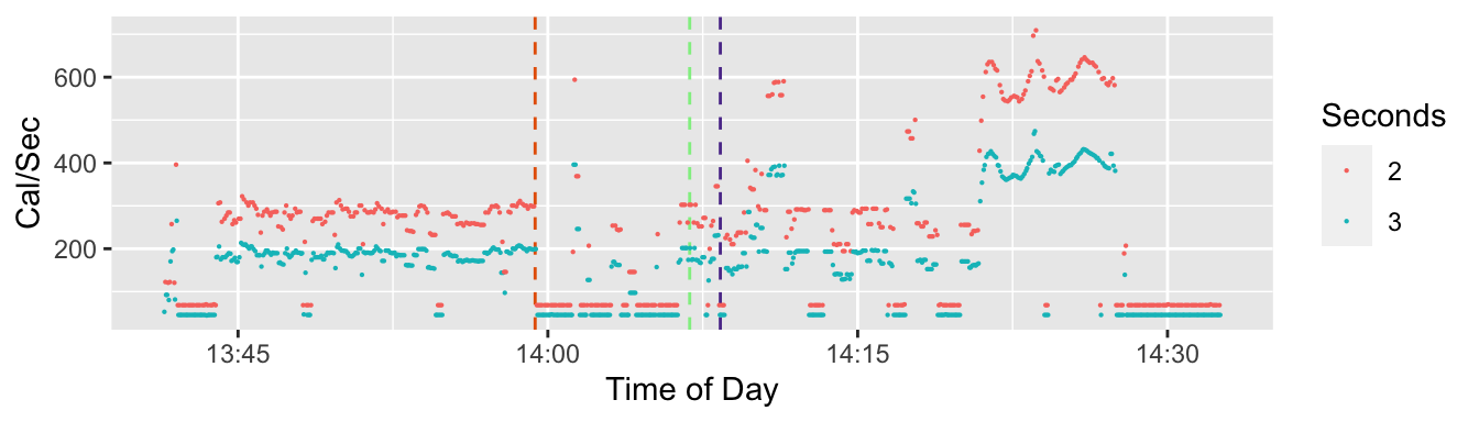
In Figure 4 I’m emphasizing the difference between lines where the span of time between the start time stamp and the end time stamp is two seconds or three seconds. The color coding shows that when the span is two seconds, one has a smaller denominator so a higher reported rate of calories per second than if the span is three seconds. On 44% of the Active Energy lines, the span of of time covered by that data row is two seconds and for 56% it’s three seconds. And they are somewhat evenly spaced. There are 1,191 rows of data for Active Energy. For most of those rows, a two second span alternates with a three second span. There are no cases where there are two cases in a row with a two-second span, and 149 cases where a three second span is followed by another three second span
What I conclude from this is that the two and three second spans are quite inaccurate because they’ve been rounded to the nearest second. The actual time period covered by each data row is closer to something a bit higher than two and half seconds and is the same or close to the same for all the rows during the workout. (Outside of workouts the span of time covered by a data row for active energy can vary by quite a bit.)
Let’s look a small batch of data to see what it looks like.
| type | start | end | span | value |
|---|---|---|---|---|
| ActiveEnergyBurned | 13:58:26 | 13:58:29 | 3 | 0.167 |
| ActiveEnergyBurned | 13:58:29 | 13:58:31 | 2 | 0.166 |
| ActiveEnergyBurned | 13:58:31 | 13:58:34 | 3 | 0.171 |
| ActiveEnergyBurned | 13:58:34 | 13:58:36 | 2 | 0.170 |
| ActiveEnergyBurned | 13:58:36 | 13:58:39 | 3 | 0.173 |
| ActiveEnergyBurned | 13:58:39 | 13:58:41 | 2 | 0.173 |
| ActiveEnergyBurned | 13:58:41 | 13:58:44 | 3 | 0.172 |
| ActiveEnergyBurned | 13:58:44 | 13:58:47 | 3 | 0.170 |
You can see in Figure 5 that the rows approximately alternate between being two or three seconds apart, but the value of Active Energy Burned remains very similar. Whether the span of time between the start and end of each data row is two or three seconds doesn’t seem to affect the value.
The result of this discussion is that there is an alternate way to interpret the time span covered by each data row during a workout. To demonstrate how that affects the interpretation, I’ll redo Figure 2, except this time I’ll assume each time period is the weighted average of the two and three second spans, which turns out to be about 2.56 seconds for the active energy data rows. Next I take that time span and use it to interpret the value reported for that row as either speed or calories per hour.
# per_second originally comes from add_intra_day function
# create a dataset where distance and calorie intervals are fixed time period
for_plot2 <- for_plot |>
  mutate(value2 = case_when(
    type == "Elevation" ~ per_second,
    type == "HeartRate" ~ value,
    type == "ActiveEnergyBurned" ~
      (value / assume_burn_span) * 3600, # calories per hour
    type == "DistanceWalkingRunning" ~
      (value / assume_speed_span) * 3600, # mile/sec to MPH
    TRUE ~ NA_real_
  ))
for_plot3 <- for_plot2 |>
  filter(local_start > as_datetime("2021-10-13 13:41:14"),
         local_start < as_datetime("2021-10-13 14:32:36"),
         ((type != "DistanceWalkingRunning") | (value2 < 6)),
         type %in% c("ActiveEnergyBurned", "HeartRate", "DistanceWalkingRunning", "Elevation")) |>
   mutate(type = factor(type, levels = c("HeartRate", "DistanceWalkingRunning", "ActiveEnergyBurned","Elevation")))
p_base_fixed <- for_plot3 |> ggplot(aes(x = local_start,
             y = value2)) +
  geom_vline(xintercept = as_datetime(possible_fall), linetype = "dashed", colour = fall_colour) +
  # geom_vline(xintercept = as_datetime(possible_resume), colour = "orange") +
  geom_vline(xintercept = as_datetime(backtrack_for_hat), linetype = "dashed", colour = pickedup_colour) + # back to look for hat
  geom_vline(xintercept = as_datetime(fall_recorded), linetype = "dashed", colour = record_colour) + # fall recorded
  # geom_vline(xintercept = as_datetime(start_downhill)) + # started down hill
  # geom_vline(xintercept = as_datetime(turn_around), colour = fall_colour) + # bottom of hill
  geom_vline(xintercept = as_datetime(get_ride), linetype = "dashed", colour = pickedup_colour) +
# picked up
  geom_vline(xintercept = as_datetime(ranger_station), colour = "darkgray") +
  geom_vline(xintercept = as_datetime(arrive_ER), colour = "darkgray") +
  xlab("Time of Day")
p <- p_base_fixed +
  geom_point(size = 0.1) +
  facet_wrap(vars(type), ncol = 1, scales = "free_y",
             strip.position = 'left',
             labeller = as_labeller(c(HeartRate = "Pulse",
                                      DistanceWalkingRunning = "Speed",
                                      ActiveEnergyBurned = "Cal/Hour",
                                      Elevation = "Feet"))) +
  ylab(NULL) +
  theme(strip.background = element_blank(),
        strip.placement='outside')

p2 <- p + geom_text(data = tribble(
  ~type, ~label,
  "ActiveEnergyBurned", "\nActive Energy",
  "HeartRate", "\nHeart Rate",
  "DistanceWalkingRunning", "\nWalking Speed",
  "Elevation", "\nElevation"
) |>
  mutate(type = factor(type, levels = c("HeartRate", "DistanceWalkingRunning",
                                        "ActiveEnergyBurned", "Elevation")),
         local_start = as_datetime("2021-10-13 13:41:14"),
         value2 = Inf),
mapping = aes(label = label), vjust = 1, hjust = 0, nudge_y = -5,
colour = "gray40", size = 5)
# colorbrewer 4 color purple orange


p2 + geom_text(data =
                 tibble(local_start = c(possible_fall, fall_recorded),
                        type = c("HeartRate", "HeartRate") |>
                          factor(levels = c("HeartRate", "DistanceWalkingRunning",
                                            "ActiveEnergyBurned", "Elevation")),
                        value2 = c(145, 145),
                        label = c("Fall", "Recorded")),
               mapping = aes(label = label, colour = label),
               hjust = 0, vjust = 0.5, nudge_x = 10) +
scale_colour_manual(guide = NULL, values = c(fall_colour, record_colour)) 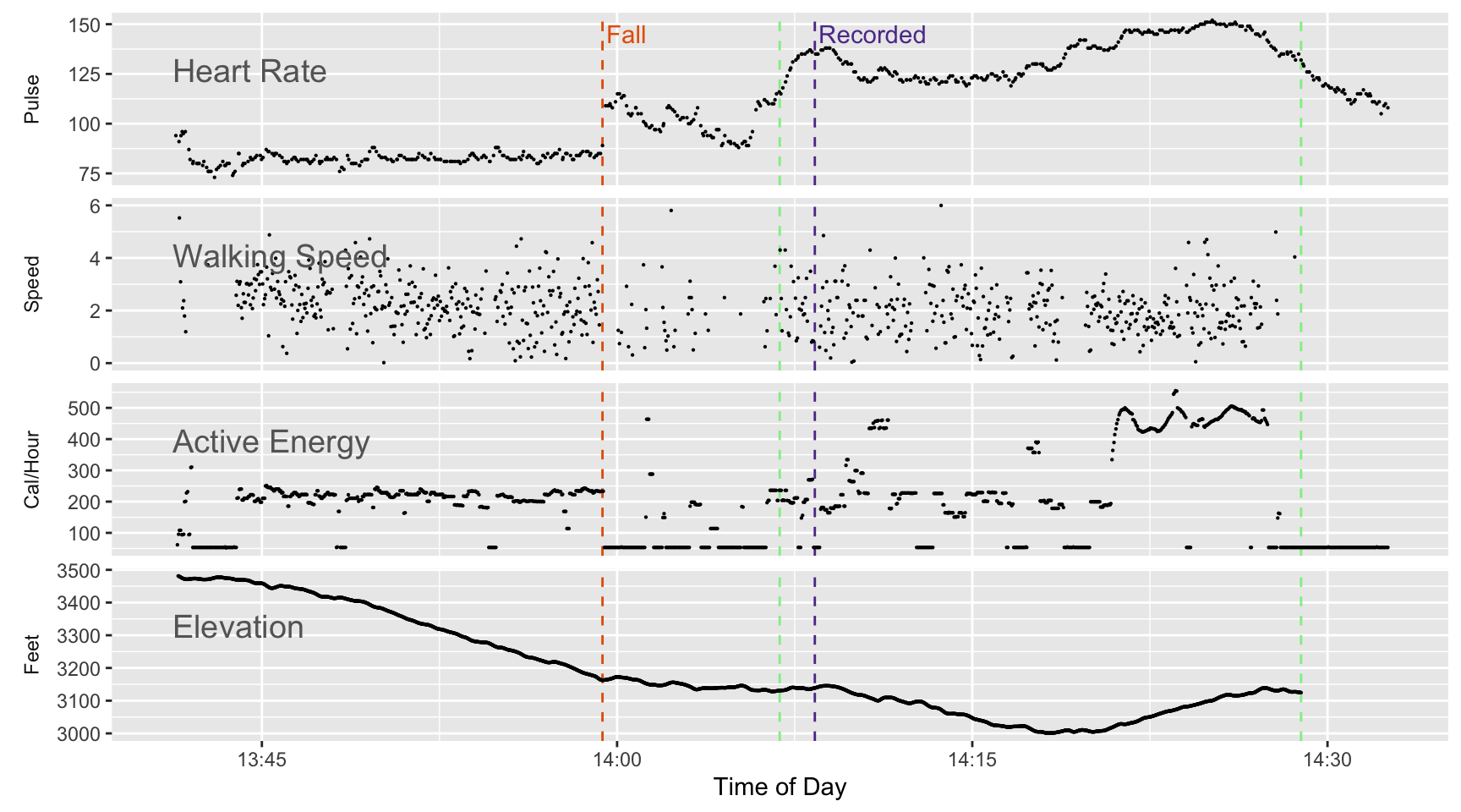
The calories burned portion of the graph looks much more orderly. We no longer see two parallel tracks.
Speed (based on changes in the reported GPS position) has the same issue I’m interpreting distance over a time span as speed. If the time span is wrong so is the speed. In Figure 6 I do the same fix for speed that I do for calories burned. Calories burned comes out much more orderly, but the effect on speed is much less obvious. I think that’s because there’s enough variability in the GPS reported location to create more variability for that portion of the chart. The variation related to a two second or three second span have as much visible impact in Figure 2 so for speed you don’t notice as much difference between the two versions.
By focusing on changes down to intervals as small as a couple of seconds, I’m trying for a precision that the data in the Health Export can’t really support. In this case I was looking for a fall that took only a second or two so there’s some justification for pushing the data this far. But in general one should be very cautious interpreting small time intervals. One can do that a bit for heart rate, and I think my earlier post relying on heart rate data shows that. But for distance moved and calories burned one needs to smooth the data over longer intervals rather than focus too much on the individual data rows in the export. For example, the data is fine enough that one might compare and contrast 200-meter segments during a run, but not fine enough that one could carefully analyze a 10-meter sprint at the end of a lap.
One simple piece advice: don’t assume the time stamps in the Health Export are accurate to to the second. Always assume that they have an error range of about half a second because they probably were either truncated or rounded to the nearest second.
This post is an example of how one might use the Apple Health Export for some sort of forensic analysis related to a crime or an investigation of an accident. One can do that, but you have to interpret the data cautiously. For example, don’t assume the time stamp on the fall data line is when the fall actually occurred.
Note: No one was permanently harmed while making the experience that went into this post. I wish to extend my thanks to the staff of the Berkshire Medical Center in Pittsfield. They did a careful, thorough job on an old guy who ended up in their care.
Fall detection was introduced with the Series 4 Watch in 2018. If you’re over 55 it is turned on by default. If younger, you have to explicitly turn it on via Settings.
On a number of occasions my Apple Watch has notified me that “it looks like you have taken a hard fall”, and offers some responses including I fell but I’m OK or I did not fall. Sometimes I have in fact fallen, and sometimes it’s a false alarm. On some long trips with hiking poles I’ve triggered a false alarm when I plant the poles firmly in the ground while I free my hands to take a picture or look at a map. While writing this post I tried to deliberately trigger a false alarm and failed. Maybe the detection algorithm has improved or I’m too timid.
Here’s Apple’s description of what happens when Fall Detection is triggered:
If your Apple Watch detects that you’re immobile for about a minute, it begins a 30-second countdown, while tapping you on the wrist and sounding an alert. The alert gets louder, so that you or someone nearby can hear it. If you don’t want to call emergency services, tap Cancel. When the countdown ends, your Apple Watch automatically contacts emergency services. When the call connects, your Apple Watch plays an audio message that informs emergency services that your Apple Watch detected a hard fall and then it shares your current location as latitude and longitude coordinates. If you previously turned on the Share During Emergency Call setting under your Medical ID, your Medical ID is also automatically shared with emergency services. The first time the message plays, the audio is at full volume, but then the volume is reduced so that you, or someone nearby, can talk to the responder. The message continues to play until you tap Stop Recorded Message or the call ends. apple support
For a lively description of fall detection, I recommend a Joanna Stern review shortly after the feature was introduced. With her usual style, she interacts with a professional stunt double to test the feature.