Guilford Demographics
The previous entry was an exercise in using R to process some data about voter registrations and the US Census related to Guilford. Because it was focused on the R code, it’s very difficult to see the actual results. I decided to do this post to highlight some interesting charts about Guilford unobscured by all the R detail. There won’t be anything here that wasn’t in the earlier post, but with luck someone can actually read this post.
In the previous post I started with voter registrations and then wandered farther off into Census data.. Here I’ll actually present some results in a reverse order. The most interesting bits in the previous post actually came from the US Census.
Population Pyramids
Most of these plots will display population pyramids. Population pyramids were invented by demographers to show the breakdown of a population by age and sex. On the vertical axis there are horizontal bars that show the number (or percent) of people in each five-year age bracket. One side are males and on the other side are females
The first plot is a basic population breakdown for Guilford for two years from the 2000 and 2010 Census.
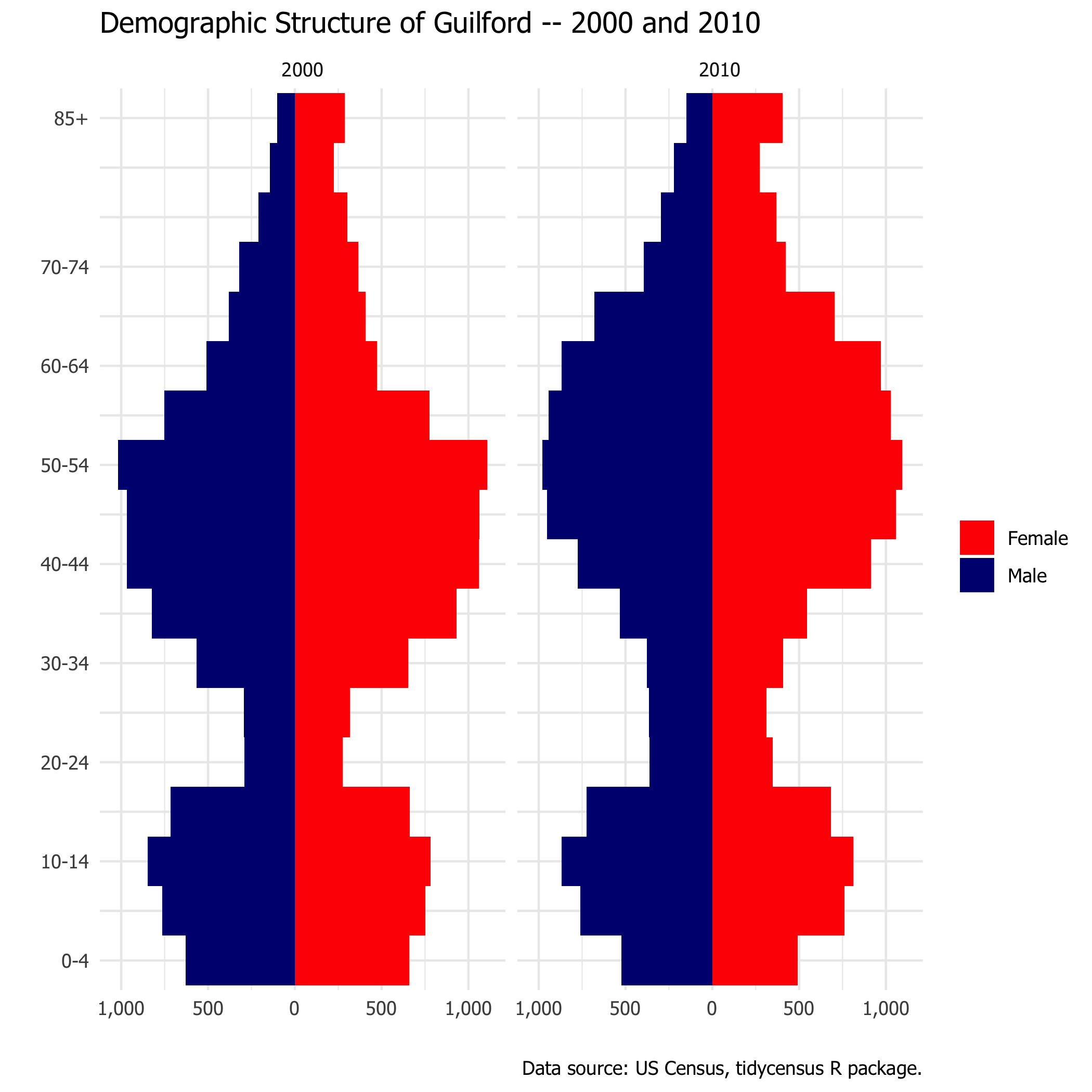
Adults in the 20 to 34 age category are relatively scarce in Guilford. Comparing 2000 and 2010, one can see that the population of Guilford is getting older. In both years age 50-54 is the largest group. But one can see the distribution moving older. The 55-64 categories have gotten much bigger between 2000 and 2010 and the 30-39 categories have gotten smaller. One expects to see a continuation of this pattern when the 2020 census data becomes available.1
National Age Distribution
The Census blog has a discussion of the national demographic structure.
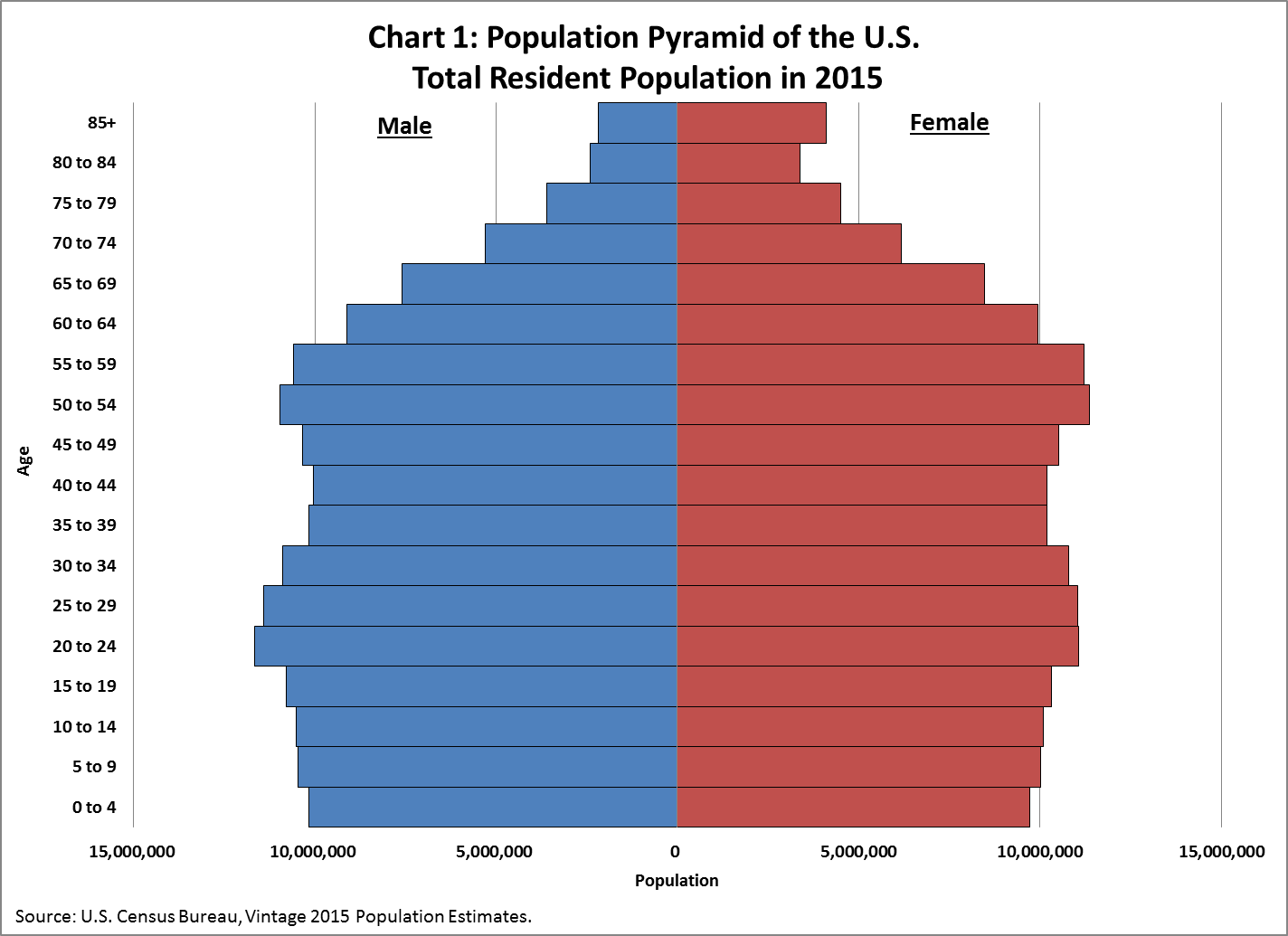
One can see the peak of the baby boom and then an echo of the baby boom in the 20-24 category. The distribution from birth to age 60 is fairly even. The bumps for the baby boom and the echo are fairly modest.
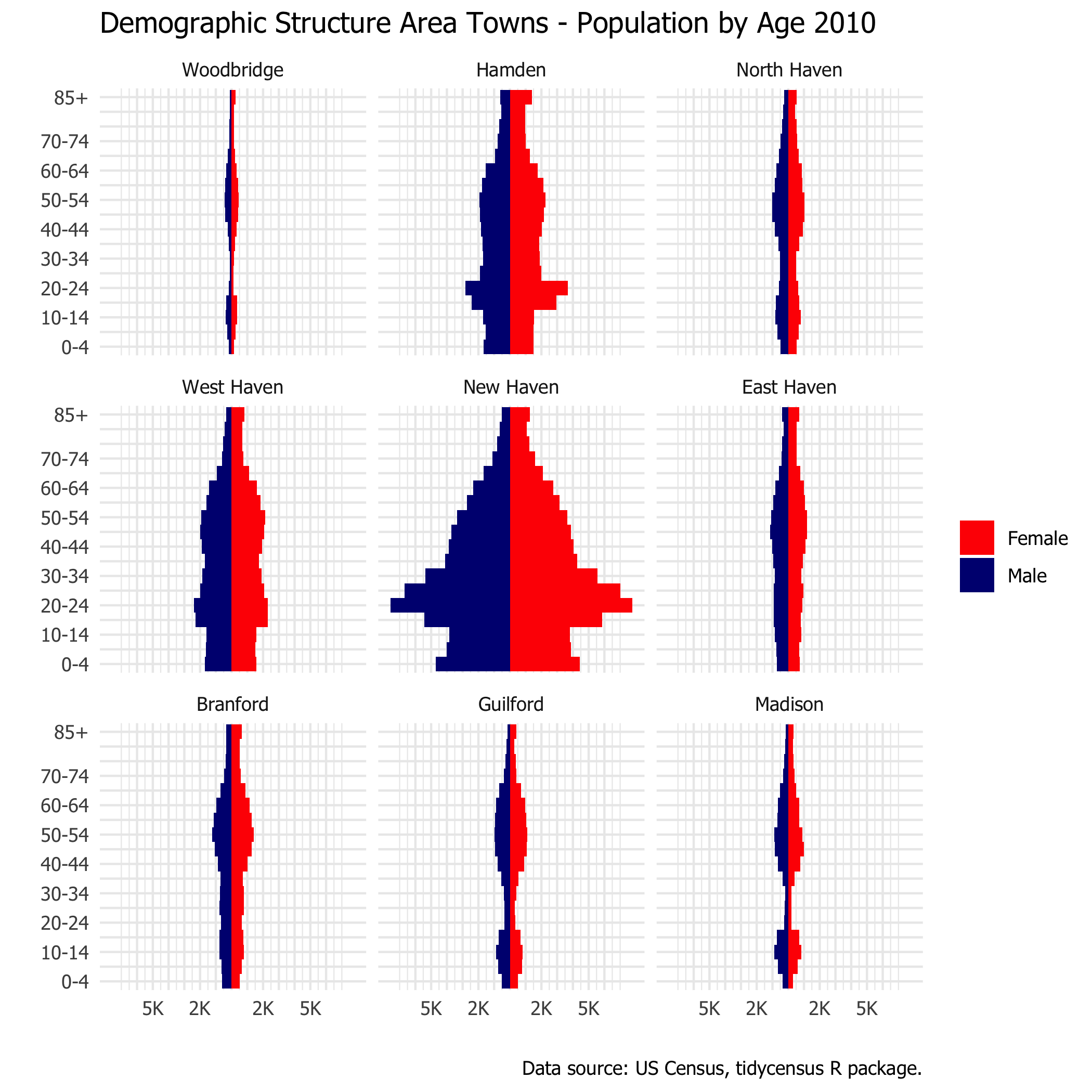
Comparing Guilford to Other Area Towns
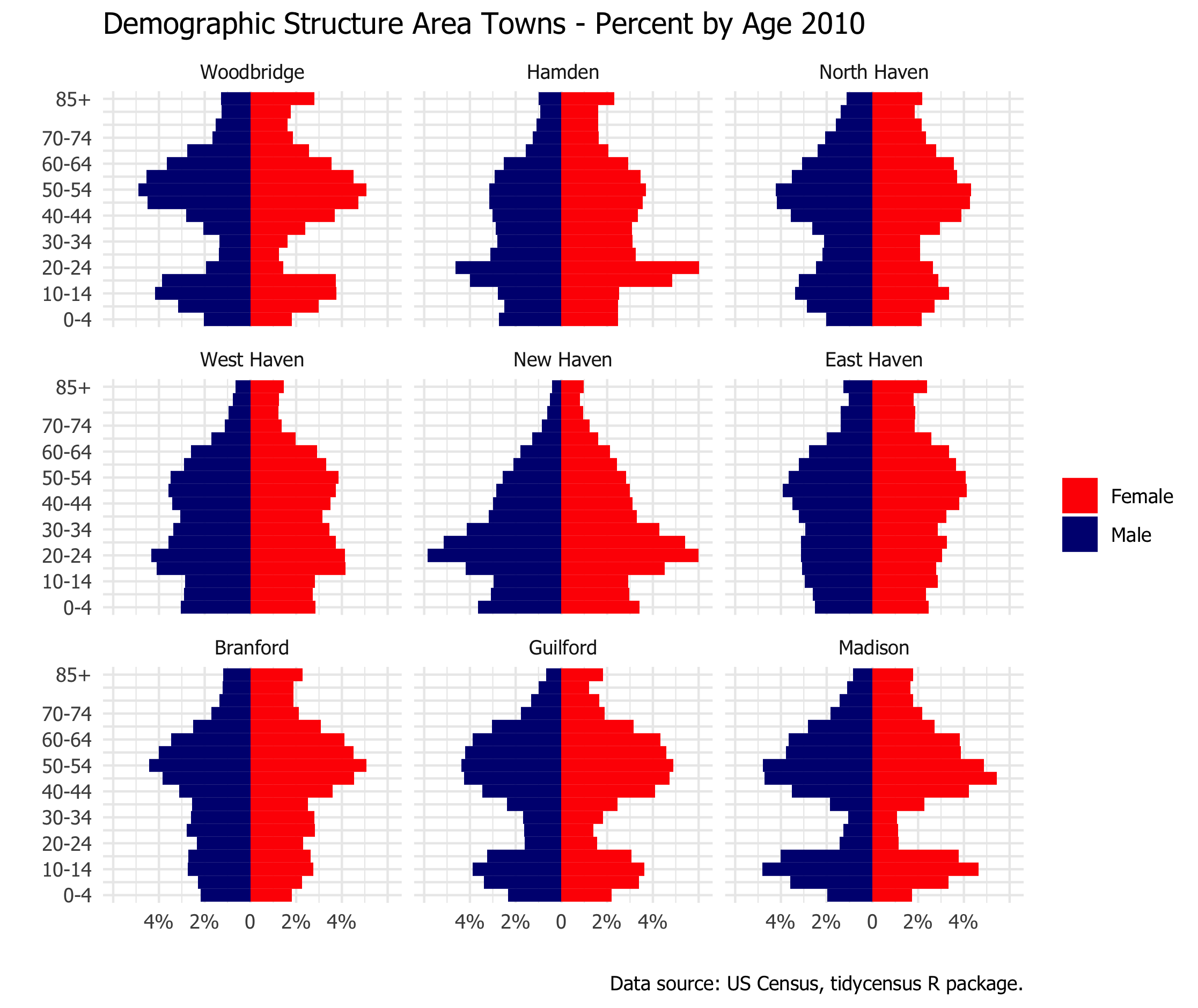
The population structure in Guilford is much different than the nation-wide pattern. This raises the question of how Guilford compare with other area towns. I picked eight other towns centered around New Haven. Below are two large plots, each with nine towns. The first plot shows the population pyramid scaled by the size of the population. It emphasizes how much larger New Haven is that each surrounding town by itself. The second plot is scaled by the total population in each town. Looking at the percentage of population in each age category emphasizes differences in the structure of the population rather than the absolute size.
The second plot by percentage makes it easier to compare the demographic structure of the towns. One can see that Guilford is similar to Madison and to Woodbridge (and to a lesser extent North Haven) in terms of the thin band in the 20 to 40 age range. I assume this is related to housing costs for young families. Note the post-secondary student age bulges for New Haven, Hamden, and West Haven because of their college populations (Yale, Quinnipiac, and University of New Haven). Branford and Est Haven do not have colleges, but still look quite different from Guilford and Madison and Woodbridge.
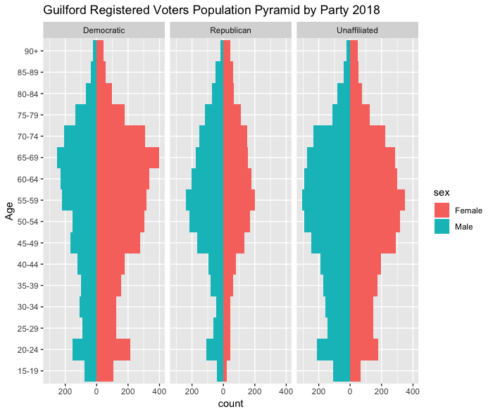
Age and Gender Demographics of Guilford Registered Voters
The initial trigger for all this was a data set of registered voters in Connecticut. As of June 2018, the breakdown by party in Guilford was 36% Democratic, 23% Republican, 40% Unaffiliated, and 1% other parties,
Below is the population pyramid for registered voters alone. There are differences by party. For Democrats 65-69 is the largest age category. For Republicans and Unaffiliated it’s 55-59. Women outnumber men throughout pyramid for the Democratic Party. For the Republicans, men consistently outnumber women except for 85 and older. Republicans look thin in the under 50 categories.
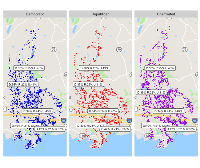
Where Are the Voters?
Finally, I got a latitude and longitude for each address in the voter registration file (known as geo-tagging. There’s a long discussion of that process in the previous post. To get some idea whether the political parties are even distributed geographically within Guilford, I tallied party registrations by polling place. There seems to be a somewhat higher percentage of Democratic voters close to Long Island Sound and somewhat lower percentage of undecided. The highest percentage of Republican voters is in the north end of town.
The plot shows each party separately. With a dot plot such as this sometimes one can have too much data. Things get lost in a swarm of dots. To thin things out a bit I am showing only a 50% sample. To my eye I don’t see much sign that voters are concentrated by party in different parts of Guilford. The summary of the party distribution by polling place is overlaid on the plot. The text labels are same on each plot. The location of the text corresponds roughly to the location of the polling place, with some adjustment to keep the summaries readable.
Conclusion
Demographic structure is an interesting way to look at the suburbs around New Haven. Before doing this I was focused on the idea that some towns were wealthier than others. Demogrphic differences are one effect of differences in wealth, and in some cases may also be a contributing cause. Young families are less likely to be wealthy and also less likely to move to the more affluent suburbs. Both demographic structure and median income have an effect on fairness of school funding across towns.
For details about how these plots were produced, see the previous entry.
In the future I expect to do more work with Census data in Connecticut and the area around New Haven and Guilford.
Footnotes
Although a complete census only is done every 10 years, the Census Bureau also conducts surveys of a sample of the population in between the decennial census. This is known as the American Community Survey. Because it is only a sample, it is unreliable if one tries to use it on a small population. My impression is that a town like Guilford is too small to expect a solid estimate from the American Community Survey. One way to use it is to look at a rolling five-year result. I may try to look at that later for the ACS up through 2017.↩︎