Exploraton of geotagging and gender identification based on voter registration dataset for Guilford. Explores geotagging, identifing gender from first name, US Census, and general data clean-up. To see just the interesting plots without lots of R-related detail, skip this post and read the next one instead.
Author
John Goldin
Published
September 8, 2018
Attention conservation notice: Unless you are interested in R-related detail, skip this post and read the next post instead.
The Data Source
It’s primary season and recently I learned about a somewhat strange site that collects a lot of voter registration data. It includes birth date and the full dataset also includes phone numbers. I was a bit surprised that this data is publicly available. Apparently I am not the only one. Here is an article from TV News in Connecticut treating this data as a controversy.
The author of this site is a fellow from new Hampshire. His primary interest is genealogy. He is unapologetic about putting all this data out onto the web and includes a robust defense of his site. In his about page, he offers the following comment:
Perhaps you have become disillusioned, because you had a false sense of privacy.
Welcome to the twenty-first century and the Information Age.
I recovered from my shock and decided to play with this data as a vehicle to become more familiar with my new home in Guilford while exercising and developing my R skills at the same time.
[Note from August 2022: the “about page” linked to above at the source of the data is no longer there. The longer discussion is gone. What remains is just this line: “It is all public information, so don’t bother requesting removal of anything.”]
An R Coding Sampler
This won’t be a coherent description of registered voters in Guilford. Instead it is a collection of various bits of loosely related R code. I grabbed onto the Guilford voter statistics because it was a way to connect to my new home. But the primary purpose was to exercise my R muscles rather than to learn about Guilford voters. I spent way more time on this than I expected. Each bit would lead me to try one more thing. Because I enjoy mapping, I wandered off into some time-consuming experimentation with geotagging.
As I spent an unreasonable time fooling around with this data, I came to regard this activity as being like a cross-stitch sampler that I inherited from my mother. The point of samplers of this sort was just to practice the craft. (I note that this one was done in 1971, the year I graduated from college.) This blog post has something in common with my mother’s sampler. Like hers, it was done for the simple pleasure of doing it (even though that involved interludes of frustration and tedium) and as an exercise to practice my skill. The result may be about as useful as a cross-stitch sampler, but “useful” isn’t the point.
One reason this has taken an unreasonable amount of time is that I started out with a mistake. When I first went to the voter registration web site, I used the interface on the page to select voters in the Town of Guilford. I then copied the list of about 20,000 names and pasted them into a text file. That was the dataset I started with. But as I progressed, I noticed some odd things about this data. It had a a noticeable number of cases where I knew people were no longer registered to vote, including names at my house who I knew no longer lived there and people who I knew were deceased or who were implausibly old. As a last step, I compared the registration data to census population data by age and in many cases saw substantially more voter registrations than population.
It just didn’t seem right. So I went back to the web site and realized that I could download a bunch of files that together constituted the complete list for Connecticut. In fact he offers the option to download data from several points in time. When I downloaded the data for June 2018, I ended up with about 15,000 active voter registrations rather than the 20,628 names I got when I just copied the results of the query on his main page. His interest is in genealogy. I suspect that what he has done is to combine all the names he found in 2013, 2014, 2016, 2017, and 2018. That’s how he includes people who have moved away or died. Perhaps for genealogy purposes he wants a list as inclusive as possible. Voting is not his focus. The downloaded data also includes a few more details than he shows in his interactive query. The upshot was that I needed to reload the larger dataset and redo my analyses. This turned out to be a case where relying on RMarkdown provided a real advantage.
As a note on the archaeology of IT, the layouts of the Connecticut dataset look to me like they were done in COBOL. One wonders how much COBOL code is still active.
Skills I Used Doing this Post
The ggmap package and geocode function
The terms of service for using Google map data
Using kable to display simple tables in RMarkdown
How hard it can be to setup a simple table in R (compared with Proc Tabulate in SAS)
Using the gender package to estimate gender from first name
Calculating age from lubridate date information
Various ways to recode data, including the recode function and the not well documented form of str_replace_all
Using the tidycensus package to get some basic data from the Census (a potentially large subject)
Using American Fact Finder (and other sources) to get variable IDs for the decennial census and the American Community Survey
Creating a population pyramid in R
Using the ggrepel package to get more readable text labels than geom_text.
Explore Basic Stats
After reading in the downloaded file of voter registrations for the Town of Guilford, we will look at some basic statistics by party.
Code
# note: sampler picture is 1395 × 1597# Code that reads in the 500MB chunk that includes Guilford:EXT2 <-read_csv("downloaded_files/SSP-2/ELCT/VOTER/EXT2",col_names =FALSE, col_types = fix_cols) %>%filter(X1 =="060")EXT2 <- EXT2 %>%arrange(X23, X21, X3)# # fl <- read_lines("downloaded_files/SSP-2/ELCT/VOTER/EXT2")construct_names <-c(paste0("elect", seq(1:20)),paste0("elect_type", seq(1:20)),paste0("elect_absentee", seq(1:20)))construct_names <- construct_names[rep(c(1, 21, 41), 20) +rep(seq(0, 19), each =3)]# a sample layout line:# 001300 10 WS-TOWN-ID PIC X(03). 00121000alayout <-read_table2("downloaded_files/alayout.txt", col_names =FALSE) %>%filter(X3 !="PIC") %>%mutate(X3 =str_to_lower(str_replace_all(X3, "-", "_"))) %>%select(X3)# next apply names from layout plus constructed names at the end of the recordnames(EXT2) <-c(str_replace(alayout$X3, "ws_", "")[1:43], construct_names, "mystery")guilford_only <- EXT2 %>%filter(town_id =="060") %>%mutate(first_name =str_trim(paste(vtr_nm_first, vtr_nm_mid)),addresses =paste0(paste(vtr_ad_num, nm_street), ifelse(is.na(vtr_ad_unit), "", paste(" Unit", vtr_ad_unit)), ", Guilford, CT"))
Code
load(paste0(data_folder, "regs from full dataset.RData"))regs <- regs %>%filter(status =="Active") regs %>%group_by(party) %>%tally() %>%arrange(desc(n)) %>%mutate(pct =paste0(round(100* n /nrow(regs), 0),'%')) %>%bind_rows(regs %>%tally() %>%mutate(party ="Total", pct ="100%")) %>%kable(col.names =c("Party", "n", "%"), format ="html", align =c("l", "r", "r"),format.args =list(big.mark =","))
Party
n
%
Unaffiliated
5,988
40%
Democratic
5,440
36%
Republican
3,450
23%
Independent
144
1%
Libertarian
19
0%
Green
18
0%
Total
15,059
100%
The winning party in Guilford is…Unaffiliated!
This is reasonably close to the stats provided by Secretary of State from 2017 which show 5,379 Democrats, 3,494 Republicans, and 5,956 unaffiliated.
Gender
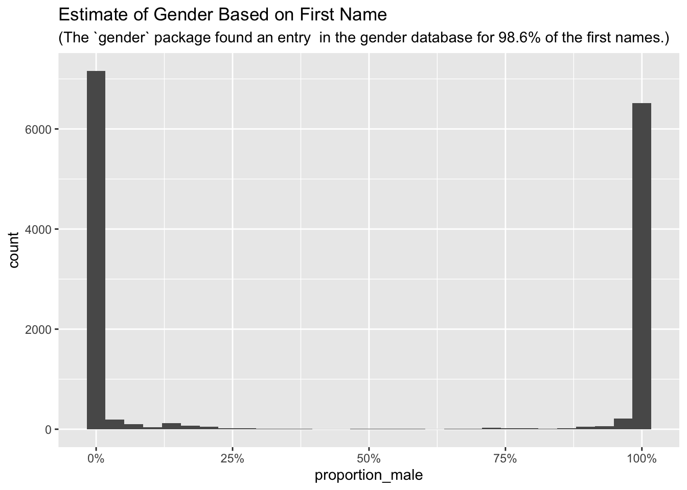
The downloaded dataset included gender, but many values were missing. One can easily get an approximate version of gender based on first name. The rOpenSci includes a package called gender to estimate gender based on first name. For the US it uses a social security database of name and gender by birth year. Based on name it gives a probability of male or female.
Code
# I clean up the first_name data to eliminate initials and then pick first word# Also interprets hyphenated first name: Mary-Beth picks out Maryregs_fn <- regs %>%mutate(dob =mdy(dt_birth), yob =year(dob),fn =map2_chr(str_split(str_replace(first_name, "^.\\.* ", ""), "[ -]"), 1, first)) # could try to use year of birth to refine gender guess, # but decided it wasn't worth pursuingfn_year <- regs_fn %>%select(fn, yob) %>%mutate(yob = (yob %/%5) *5) %>%unique()all_fn <-unique(fn_year$fn)# call the gender function to get percent male/femalesimple_gender <- gender::gender(all_fn) %>%mutate(gender_guess =ifelse(proportion_male >0.5, "Male", "Female"))
Here are some names that fall between 45% and 55% male (i.e., close to a coin flip).
And here is the distribution of observed first names compared with the baseline stats supplied by the gender package. You can’t get more bi-modal than this. The gender guesses are not 100% accurate, but most are quite unambiguous.
Code
name_found <-left_join(regs_fn, simple_gender, by =c("fn"="name")) %>%filter(!is.na(proportion_male))for_subtitle <-paste(sprintf("(The `gender` package found an entry in the gender database for %4.1f%%", (nrow(name_found) /nrow(regs_fn)) *100), "of the first names.)")ggplot(data = name_found, aes(x = proportion_male)) +geom_histogram() +scale_x_continuous(labels = scales::percent) +labs(title ="Estimate of Gender Based on First Name", subtitle = for_subtitle)
Of the small number of first names that were not found by the gender package, I would guess that more than 90% are non-European or at least non-English-speaking names.
Now we are ready to do a basic table showing the number of registered voters by party and gender. Women are less likely to be unaffiliated and more likely to be Democrats than are men.
Code
# gosh, it takes a lot of fooling around to produce a straightforward tableregs_fn <- regs_fn %>%left_join(simple_gender %>%select(fn = name, sex = gender_guess))
Joining, by = "fn"
Code
miss_codes <- regs_fn %>%filter((sex =="Female"& (vtr_sex =="M")) | ((sex =="Male") & (vtr_sex =="F")))# % of cases where vtr_sex is present where vtr_sex is different than guess of sex# note that sprintf format %3.1f rounds. rate_of_misscodes <-sprintf("%3.1f%%", (nrow(miss_codes) /nrow(regs_fn %>%filter(vtr_sex !="U", !is.na(sex)))) *100)regs_fn <- regs_fn %>%mutate(sex =ifelse(vtr_sex =="M", "Male",ifelse(vtr_sex =="F", "Female", ifelse(is.na(sex), "Unknown", sex))))by_party <- regs_fn %>%mutate(Party =factor(case_when( party %in%c("Democratic", "Republican", "Unaffiliated") ~ party,TRUE~"Other" ), levels =c("Democratic", "Republican", "Unaffiliated", "Other", "Total"))) %>%group_by(Party) %>%summarise(Men =sum(sex =="Male"), Women =sum(sex =="Female"), Unknown =sum(sex =="Unknown"),Count =n())totals = by_party %>%summarise(Party =factor("Total", levels =c("Democratic", "Republican", "Unaffiliated", "Other", "Total")), Men =sum(Men), Women =sum(Women), Unknown =sum(Unknown), Count =sum(Count))by_party <-bind_rows(by_party, totals) %>%mutate(`% Women`=sprintf(" %4.f%% ", round((Women / (Count - Unknown)) *100, 1)),`% of Total`=sprintf(" %4.f%% ", round((Count / totals$Count) *100, 1)))kable(by_party, align =c("l", "r", "r", "r", "r", "c", "c"), format.args =list(big.mark =",", width =6, justify ="r"))
Party
Men
Women
Unknown
Count
% Women
% of Total
Democratic
2,178
3,252
10
5,440
60%
36%
Republican
1,856
1,585
9
3,450
46%
23%
Unaffiliated
2,907
3,070
11
5,988
51%
40%
Other
107
74
0
181
41%
1%
Total
7,048
7,981
30
15,059
53%
100%
Age
Given that birth date is included in the dataset, let’s take a look at age. The first thing to do is to check the outliers. There are some people who are under 18. I was surprised to learn that in Connecticut a 17 year old can register to vote in a primary if they will turn 18 by the time of the general election.
Here is the code that converts the text date of birth into a value for age and that does some other recoding.
Code
library(lubridate) # https://stackoverflow.com/questions/31126726/efficient-and-accurate-age-calculation-in-years-months-or-weeks-in-r-given-bcompute_age <-function(from, to) { from_lt =as.POSIXlt(from) to_lt =as.POSIXlt(to) age = to_lt$year - from_lt$yearifelse(to_lt$mon < from_lt$mon | (to_lt$mon == from_lt$mon & to_lt$mday < from_lt$mday), age -1, age)}# create named vector to use with str_replace that will find name and replace with value.# Full dataset has age as mm/dd/yyyy so I didn't need this code.# fnd <- c("born: ", " January ", " February ", " March ", " April ", # " May ", " June ", " July ", " August ", # " September ", " October ", " November ", " December ")# repl <- c("", "-01-", "-02-", "-03-", "-04-", # "-05-", "-06-", "-07-", "-08-", # "-09-", "-10-", "-11-", "-12-")# names(repl) <- fnd # repl will be used in str_replace_allregs_age <- regs_fn %>%left_join(simple_gender, by =c("fn"="name")) %>%mutate(sex =ifelse(is.na(proportion_male), "Unknown", ifelse(proportion_male >0.5, "Male", "Female")),Party =factor(case_when( party %in%c("Democratic", "Republican", "Unaffiliated") ~ party,TRUE~"Other" ), levels =c("Democratic", "Republican", "Unaffiliated", "Other", "Total")),age =compute_age(dob, ymd("2017-11-03")),age =ifelse(age >105, NA_real_, age),# create Age groups:Age =paste0((age %/%5) *5,"-",(age %/%5) *5+4)) %>%select(first_name, last_name, yob, age, Age, sex, Party, addresses, vtr_sex, poll_place)
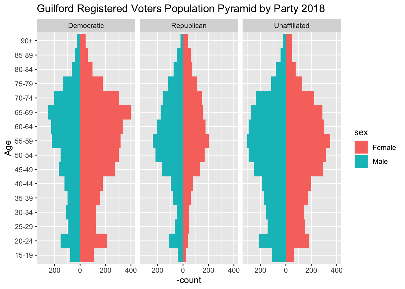
for_pop_pyramid <- regs_age %>%filter(sex !="Unknown", !is.na(age), age <105, Party !="Other") %>%mutate( Age =if_else(age >=90, "90+", Age)) %>%arrange(age) %>%mutate(Age =fct_inorder(factor(Age)))party_pyramid <-ggplot(data = for_pop_pyramid, aes(x = Age, fill = sex)) +geom_bar(data =subset(for_pop_pyramid, sex =="Female"), width =1) +geom_bar(data =subset(for_pop_pyramid, sex =="Male"), , width =1,mapping =aes(y =- ..count.. ),position ="identity") +scale_y_continuous(labels = abs) +coord_flip() +labs(title ="Guilford Registered Voters Population Pyramid by Party 2018") +xlab("Age") +facet_wrap(~ Party)print(party_pyramid)
There are differences by party. For Democrats 65-69 is the largest age category. For Republicans and Unaffiliated it’s 55-59. Women outnumber men throughout pyramid for the Democratic Party. For the Republicans, men consistently outnumber women except for 85 and older. Republicans look thin in the under 50 categories.
US Census Data for Guilford
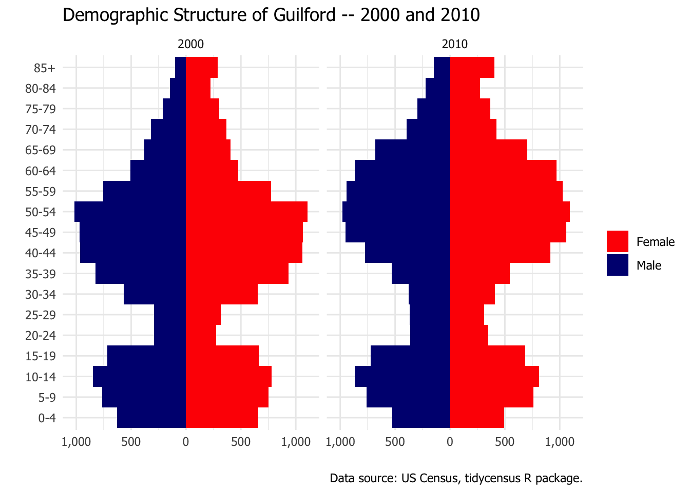
Next we will retrieve US Census data to do the same thing for the total population of Guilford in 2000 and 2010.1
Code
library(tidycensus)census_age_sex <-function(census_year =2010, towns =c("Guilford")) { decvars <-load_variables(census_year, "sf1", cache =TRUE)# if (census_year == 2000) concept_label <- "SEX BY AGE \\[49\\]"# else concept_label <- "SEX BY AGE" first_var <-which(decvars$name =="P012003") last_var <-which(decvars$name =="P012049") vars <- decvars$name[first_var:last_var]# dec2010$label[985:1031]# we need to weed out the Total Female variabe vars <- vars[vars !="P012026"]# vars <- vars[vars != first(dec2010$name[dec2010$label == "Total!!Female"])]# [1] "P011002" "P011003" "P011004" "P011005" "P011006" "P011007" "P011008"# [8] "P011009" "P011010" "P011011" "P011012" "P011013" "P011014" "P011015"# [15] "P011016" "P011017" "P011018" "P011019" "P011020" "P011021" "P011022"# [22] "P011023" "P011024" "P011025" "P011026" "P011027" "P011028" "P011029"# [29] "P011030" "P011031" "P011032" "P011033" "P011034" "P011035" "P011036"# [36] "P011037" "P011038" "P011039" "P011040" "P011041" "P011042" "P011043"# [43] "P011044" "P011045" "P011046" "P011047" "P011048" # get my key for the census APIsource("~/Dropbox/Programming/R_Stuff/my_census_api_key.R") age_x_sex <-get_decennial(variables = vars, # table = "P12",summary_var ="P012001",geography ="county subdivision", county ="New Haven",# sumfile = "SF3",state ="CT", cache =TRUE, year = census_year)# Note the interesting filter using map_lgl to take advantage of passing vector to str_detect# Filter can also be written as: filter(map_lgl(NAME, ~ any(str_detect(., towns)))) guilford_age <- age_x_sex %>%filter(map_lgl(NAME, function(x) {any(str_detect(x, towns))})) %>%left_join(decvars, by =c("variable"="name")) %>%arrange(NAME, variable)# format and coding based on https://walkerke.github.io/2017/10/geofaceted-pyramids/ agegroups <-c("0-4", "5-9", "10-14", "15-19", "15-19", "20-24", "20-24", "20-24", "25-29", "30-34", "35-39", "40-44", "45-49", "50-54", "55-59", "60-64", "60-64", "65-69", "65-69", "70-74", "75-79", "80-84", "85+") agesex <-c(paste("Male", agegroups), paste("Female", agegroups)) guilford_age$group <-rep(agesex, length(unique(guilford_age$NAME))) guilford_age$year <- census_yearreturn(guilford_age)}towns <-paste0("^", c("New Haven", "Guilford","Branford", "Hamden","Madison","East Haven","West Haven", "North Haven", "Woodbridge"))x1 <-census_age_sex(census_year =2000)
To install your API key for use in future sessions, run this function with `install = TRUE`.
Adults in the 20 to 34 age category are relatively scarce in Guilford. Comparing 2000 and 2010, one can see that the population of Guilford is getting older. In both years age 50-54 is the largest group. But one can see the distribution moving older. The 55-64 categories have gotten much bigger between 2000 and 2010 and the 30-39 categories have gotten smaller.
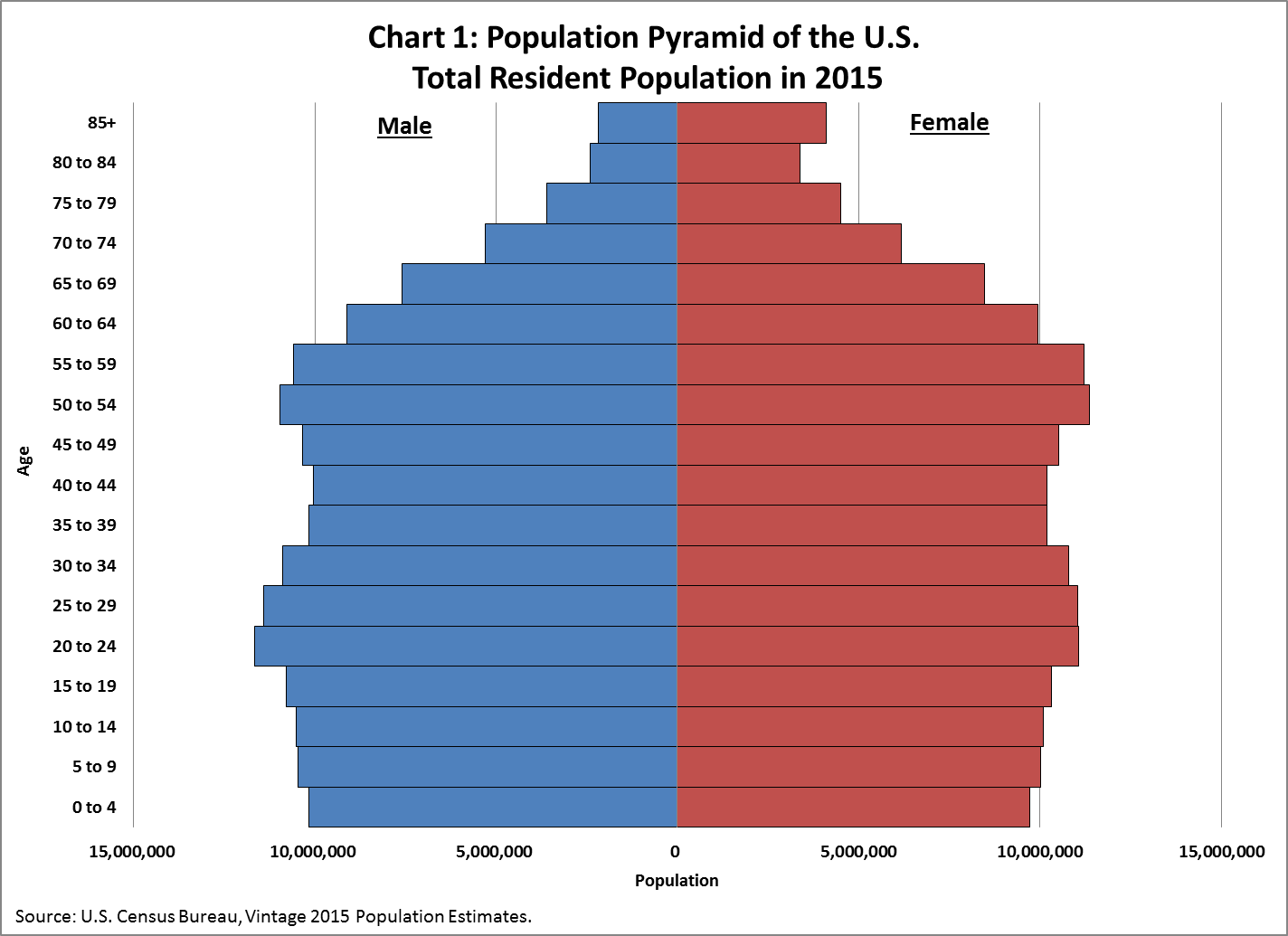
National Age Distribution
The Census blog has a discussion of the national demographic structure.
US Demograpic Structure
One can see the peak of the baby boom and then an echo of the baby boom in the 20-24 category.
Comparing Guilford to Other Area Towns
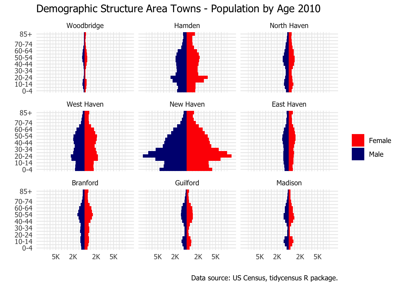
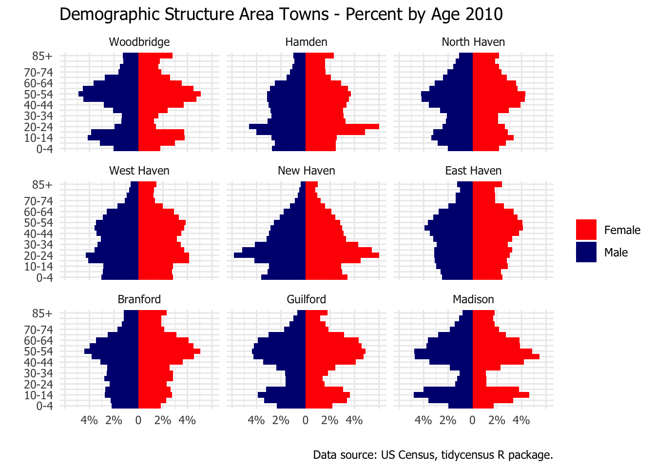
The population structure in Guilford is much different than the nation-wide pattern. This made me curious about how Guilford compared with some other area towns. I picked eight other towns centered around New Haven. That gives me two large plots, each with nine towns. The first plot shows the population pyramid scaled by the size of the population. It emphasizes how much larger New Haven is that each surrounding town by itself. The second plot is scaled by the total population in each town. Looking at the percentage of population in each age category emphasizes differences in the structure of the population rather than the absolute size.
One can see that Guilford is similar to Madison and to Woodbridge (and to a lesser extent North Haven) in terms of the thin band in the 20 to 40 age range. I assume this is related to housing costs for young families. Note the post-secondary student age bulges for New Haven, Hamden, and West Haven because of their college populations (Yale, Quinnipiac, and University of New Haven).
town_pyramids_pct <-ggplot(data = age, aes(x = age, y = pct, fill = sex)) +geom_bar(stat ="identity", width =1) +scale_y_continuous(breaks=c(-6, -4, -2, 0, 2, 4, 6),labels=c("", "4%", "2%","0", "2%", "4%", "")) +coord_flip() +theme_minimal(base_family ="Tahoma") +scale_x_discrete(labels = xlabs2) +scale_fill_manual(values =c("red", "navy")) +# theme(panel.grid.major = element_blank(), # panel.grid.minor = element_blank(),# strip.text.x = element_text(size = 6)) + labs(x ="", y ="", fill ="", title ="Demographic Structure Area Towns - Percent by Age 2010", caption =paste("Data source:", "US Census, tidycensus R package.")) +facet_wrap(~ town)print(town_pyramids_pct)
Guiford Regisration Rates
Let’s directly compare the Guilford registered voter counts of 2018 to the 2010 census. That’s not an exact comparison because the population changed between 2010 and 2018.2 And the registered voter list appears to include some people who moved away or died.
Remember that the numerator (voters) is from 2018 and the denominator (population) is from 2010. That’s how we are able to have some categories where we have more voters than population. Presumably the 70-74 category shows as 159% of the population in 2010 because a large chunk of people who were in the 65-69 category in 2010 were in the 70-74 category in 2018 for registrations. The same would be true for some other categories as a bulge of older people moved through the age categories.
Geotagging – Where are the Voters?
I did some simple geotagging years ago, and this dataset of addresses cried out for more. The ggmap package includes a function called geocode that takes an address and returns longitude and latitude.
In theory geo-coding involves a straightforward call to the geocode function. That was true if I relied on the default source. But when I used Google as a source, it was much more problematic. I had to call geocode one address at a time and wrap that call with code that would survive failures. Google limits the number of calls and also the speed of the calls. As a result it doesn’t return a result and geocode does not handle those failures gracefully. I had to divide up the 8,000+ addresses into batches and feed them to Google in bits and pieces over a period of several days.
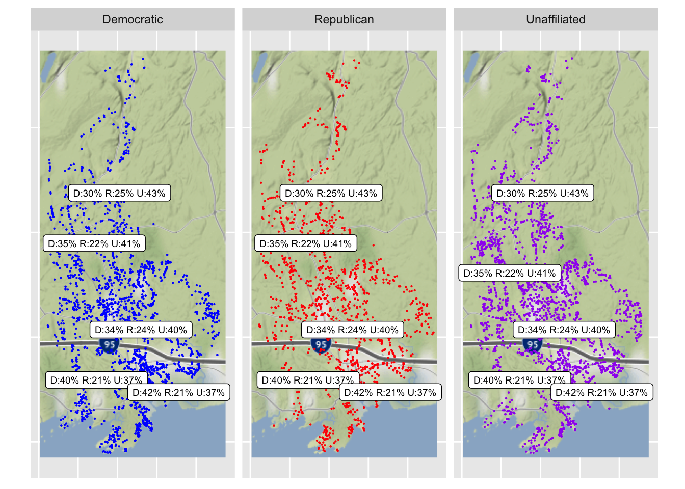
First I’ll show the basic registration counts by polling place. Then I’ll display a basic map showing where the voters are located, separately by party.
Here are the basic voter registration counts by polling place. The percentage of Republican voters ranges between 21% and 25%. There’s a somewhat larger range for Democratic voters (30% to 42%).
Joining, by = "poll_place"
Joining, by = "poll_place"
Code
kable(place_summary %>%select(`Polling Place`= poll_place, n = subtotal, summary), format.args =list(big.mark =","), caption ="Guilford Voter Registratins by Polling Place")
Guilford Voter Registratins by Polling Place
Polling Place
n
summary
A.W. Cox School
2,852
D:40% R:21% U:37%
Abraham Baldwin School
3,032
D:35% R:22% U:41%
Calvin Leete School
2,745
D:42% R:21% U:37%
Guilford Fire Headquarters
3,466
D:34% R:24% U:40%
Melissa Jones School
2,964
D:30% R:25% U:43%
There seems to be a tendency for the polling locations close to the Sound to have a higher percentage of Democrats and a lower percentage of Unaffiliated. The far north is the most Republican. None of these effects are large.
Code
# I'm loading in data already geo-tagged because geocoding was a bit messy in practice.load(paste0(data_folder, "google_addr.RData"))load(paste0(data_folder, "dsk_addr.RData"))# At the end of this post I'll append a long block of code that shows how geocoded addresses.guilford_center_lat <-41.32guilford_center_lon <--72.699986guilford_left_bottom_lon <--72.749185guilford_left_bottom_lat <-41.242489guilford_right_top_lon <--72.631308guilford_right_top_lat <-41.436585guilford_right_lower_lat <-41.34guilford_boundaries <-c(left = guilford_left_bottom_lon, bottom = guilford_left_bottom_lat,right = guilford_right_top_lon, top = guilford_right_top_lat)guilford_base <-ggmap(get_map(location = guilford_boundaries, zoom =11,maptype ="roadmap", source ="google"))
p <- guilford_base +geom_point(data = regs_loc %>%filter(Party %in%c("Democratic", "Republican", "Unaffiliated")) %>%sample_frac(size =0.5), aes(x = lon, y = lat, color = Party), size =0.1) +facet_wrap(~ Party) +xlim(c(guilford_left_bottom_lon, guilford_right_top_lon)) +ylim(c(guilford_left_bottom_lat, guilford_right_top_lat)) +# guilford_right_top_latscale_color_manual(values=c("blue", "red", "purple"))
Scale for 'x' is already present. Adding another scale for 'x', which will
replace the existing scale.
Scale for 'y' is already present. Adding another scale for 'y', which will
replace the existing scale.
Code
p <- p +theme(axis.text.x =element_blank(), axis.ticks.x =element_blank(),axis.text.y =element_blank(), axis.ticks.y =element_blank(),axis.line =element_blank()) +theme(legend.position="none") +xlab(NULL) +ylab(NULL)# dusing the ggrepel package to keep the polling place summary visiblep <- p +geom_label_repel(data = place_summary, aes(label = summary), colour ="black", size =2.5)print(p)
Warning in min(x): no non-missing arguments to min; returning Inf
Warning in max(x): no non-missing arguments to max; returning -Inf
Warning in min(x): no non-missing arguments to min; returning Inf
Warning in max(x): no non-missing arguments to max; returning -Inf
Warning in min(x): no non-missing arguments to min; returning Inf
Warning in max(x): no non-missing arguments to max; returning -Inf
Warning in min(x): no non-missing arguments to min; returning Inf
Warning in max(x): no non-missing arguments to max; returning -Inf
Warning in min(x): no non-missing arguments to min; returning Inf
Warning in max(x): no non-missing arguments to max; returning -Inf
Warning in min(x): no non-missing arguments to min; returning Inf
Warning in max(x): no non-missing arguments to max; returning -Inf
The plot shows each party separately. With a dot plot such as this sometimes one can have too much data. Things get lost in a swarm of dots. To thin things out a bit I am showing only a 50% sample. This is a ggplot2 dot plot with a Google map as background (based on the ggmap package). To my eye I don’t see much sign that voters are concentrated by party in different parts of Guilford. The summary of the party distribution by polling place is overlaid on the plot. The text labels are same on each plot. The location of the text corresponds roughly to the location of the polling place, with some adjustment to keep the summaries readable.
Geotagging: Into the Weeds
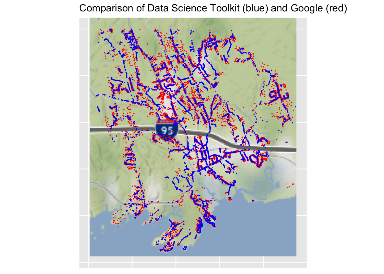
There is a lot of information on the web about geocoding. The geocode function in ggmap provides an interface to two sources of geocoding: the Data Science Toolkit and the Google Maps Platform. The Google terms of services has a number of restrictions. Unless one gets set up to pay for the Google service, there is a limit on the total number of searches per day (which may be 2,500) and a limit on the number of searches per second. For most purposes the Data Science Toolkit is probably good enough. Out of curiosity I tried both. In practice I had a difficult time geocoding the 8,000+ addresses via Google. I was tripped up by both the daily limit and the search per second limit. The geocode function did not seem to fail gracefully so I had to wrap it in try-catch code. It ended up taking me almost a week to get all the addresses geocoded via Google.
Via ggmap it’s easy to throw up a quick plot showing the results of the geocoding. Watch out for outliers. With both Data Science Toolkit and Google I had two addresses that ended up in Turkey. They were both addresses that had a street address that ended with something like “Unit #5”. All the addresses ended with “Guilford, CT.” Tacking on “USA” after the state helped eliminate the wackiest results. But I found a number of other cases that produced a latitude and longitude well outside of the boundaries of Guilford.
For most purposes the default result from geocode will be adequate. But I was curious about the quality of the results and where they came from. A number of academic geography-type programs get into these issues. See Texas A&M GeoServices as an example. I think you can submit batch files of addresses to them as an alternative to using something like the geocode function in ggmap. Out of personal interest, I decided to evaluate my geocodes by directly comparing the results based on Google and on the Data Science Toolkit.
Code
p_dsk_google <- google_dsk_map <- guilford_base +geom_point(data = google_addr , aes(x = lon, y = lat), size =0.1, colour ="red") +geom_point(data = dsk_addr, aes(x = lon, y = lat), size =0.1, colour ="blue") +xlim(c(guilford_left_bottom_lon, guilford_right_top_lon)) +ylim(c(guilford_left_bottom_lat, 41.34)) +# guilford_right_top_latggtitle("Comparison of Data Science Toolkit (blue) and Google (red)") +theme(axis.text.x =element_blank(), axis.ticks.x =element_blank(),axis.text.y =element_blank(), axis.ticks.y =element_blank(),axis.line =element_blank()) +theme(legend.position="none") +xlab(NULL) +ylab(NULL)
Scale for 'x' is already present. Adding another scale for 'x', which will
replace the existing scale.
Scale for 'y' is already present. Adding another scale for 'y', which will
replace the existing scale.
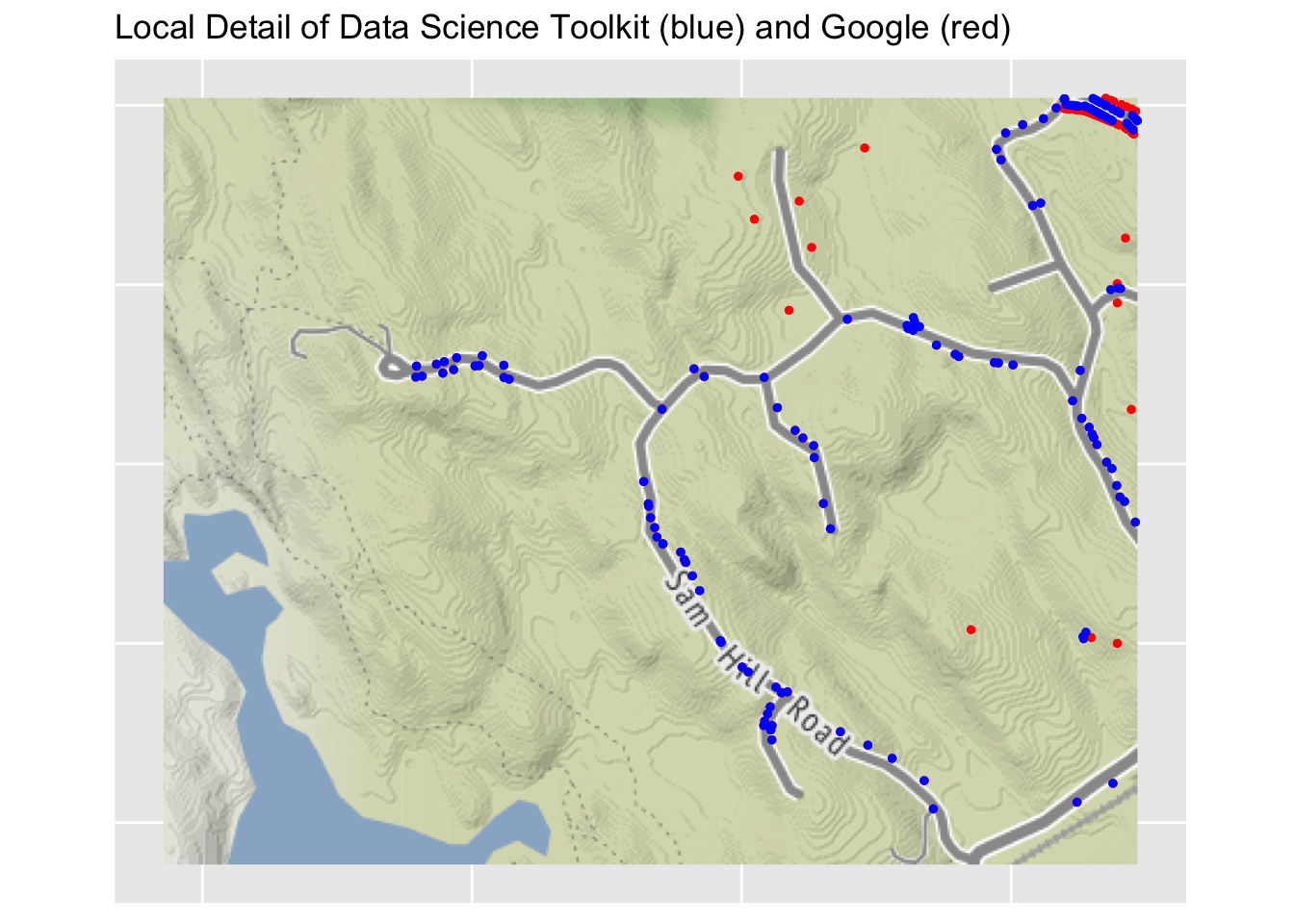
This plot uses the geocodes provided by Google (in red) and then Data Science Toolkit (in blue). Because of the order in which the points were applied, if an address has the same location from both sources, the blue point will overwrite the red point, that is, only blue will be visible. Blue points are along roads only. That means that the Data Science Toolkit geocodes show the location along the road only. Google codes are often on top of the building (as seen on a close-up view using the satellite map). In my immediate neighborhood one can only see blue points, meaning the Data Science Toolkit and Google are giving exactly the same latitude and longitude.
I don’t draw much of any practical conclusion from this.
The satellite map of the area around my house shows the results of geocoding in detail. In this area there are lots of addresses for which Google and Data Science Toolkit give exactly the same longitude and latitude, in which case only a blue dot appears (because the red dot is underneath). In the satellite map one can see the actual houses, so one can see places (such as Three Corners Road) where geocoding is approximately correct, but the houses are more strung out than the geocodes imply. One interesting street is Greenwood Lane. Google correctly shows the locations of the houses on this small and relatively new street. The Data Science Toolkit shows all of the addresses as being at the location where Greenwood Lane intersects with Three Corners Road. It illustrates that the services that are providing geocodes have significant technical details when it comes down to identifying the precise location of address. Plus one wonders whether Google distinguishes the location of the house from the location of the entrance of driveway, given that the latter is what is relevant for providing turn-by-turn directions.
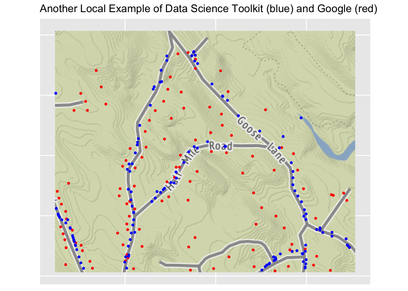
Finally, here is another example that zooms in on a small local neighborhood. In this case you can see clearly how Google locates individual homes fairly well while the Digital Science Toolkit has blue dots strung out along the road, and not always lined up well with the location of the houses. The only identifying information on this bit of Google maps is Sullivans Pits Septic Lagoons. Not a very nice name for a neighborhood.
Conclusion
Has anyone read this far? Why?
I wouldn’t say I have learned a lot of new R techniques doing this exercise. What I did do was to solidify some bits and techniques I already knew. The way this post will be useful for me is that it contains lots of details that will come up again in other work that I will do. I’ll remember that I did something here and be able to go back and look at the code I used. That’s why I have left in every bit of R code here. Perhaps that makes the post unreadable for any general user (should such a critter actually encounter it), but that’s exactly what may make the post useful for me in the future.
Sample Function to Apply Geocode Function
As promised, below I have pasted the functions I wrote to try to cope with the difficulties of using the geocode function with Google as a source.
Code
# Geocoding a csv column of "addresses" in R# from: http://www.storybench.org/geocode-csv-addresses-r/#test: wrap_geocode("248 Sam Hill Rd, Guilford, CT", 28)#test: geocode("248 Sam Hill Rd, Guilford, CT", output = "latlona", source = "dsk")#test: xx <- wrap_geocode("ksdfjsdfaf",23)wrap_geocode_single <-function(an_address, an_id, src2 ="dsk") { result <-data_frame(in_address = an_address, id = an_id, lat =NA_real_, lon =NA_real_, out_address ="", rc ="") try_result =tryCatch({ geo_rc <-0 geo_result <-geocode(an_address, output ="latlona", source = src2, messaging =FALSE)if (ncol(geo_result) <=2) { result$rc[1] <-paste(nrow(geo_result), "rows", "and", ncol(geo_result), "columns returned from geocode.")return(result) } elseif (nrow(geo_result) ==1) { geo_rc <-1 result$lon[1] <- geo_result$lon[1] result$lat[1] <- geo_result$lat[1] result$out_address[1] <-as.character(geo_result$address[1]) result$id[1] <- an_id result$in_address[1] <- an_address result$rc[1] <-"OK"return(result) } else { result$rc[1] <-paste(nrow(geo_result), "rows returned from geocode.")return(result) } }, error =function(e) { result$rc[1] <-as.character(e)return(result) })return(try_result)}# If at first you don't succeed, try again# I'm hoping this introduces enough of a delay to take care of google problemwrap_geocode <-function(an_address, an_id, src ="dsk") {if (src =="google") if (as.numeric(geocodeQueryCheck()) ==0) return(NULL) xx <-wrap_geocode_single(an_address, an_id, src2 = src)if (src =="google") Sys.sleep(0.2)if (xx$rc[1] !="OK") {Sys.sleep(0.2)if (src =="google") if (as.numeric(geocodeQueryCheck()) ==0) return(NULL) xx <-wrap_geocode(an_address, an_id, src = src) }return(xx)}
I tried looking at the American Community Survey, which is based on a sample taken by the Census Bureau in between the decennial census. Guilford seems to be too small to provide a reliable breakdown by age and sex using the American Community Survey. It might require something at the county level or higher to provide decent estimates for the 5-year age categories.↩︎
 Because I enjoy mapping, I wandered off into some time-consuming experimentation with geotagging.