suppressPackageStartupMessages(
  library(tidyverse))
# tidyverse loads these packages:
# Loading tidyverse: ggplot2
# Loading tidyverse: tibble
# Loading tidyverse: tidyr
# Loading tidyverse: readr
# Loading tidyverse: purrr
# Loading tidyverse: dplyr
suppressPackageStartupMessages(library(stringr))    # for processing strings
suppressPackageStartupMessages(library(lubridate)) # for datesAn Implementation of Narcissism in R
personal
Quantified-Self
Describes using R to track my weight for more than 20 years. More of an example of marcissism than an implementation.
Revised 05/16/2019 with later data.
This post is more an example of narcissism, but implementation has a nice technical ring to it.
Narcissism hasn’t been part of my every-day vocabulary, although it has been in the news recently. Lately we have been seeing discussions about narcissistic personality disorder, but that is not what I am talking about here. At least I hope not, because I’m talking about me.
Here’s the definition that fits this post:
Narcissism noun
1. inordinate fascination with oneself; excessive self-love; vanity. Synonyms: self-centeredness, smugness, egocentrism.
So “inordinate fascination with oneself” may be a good characterization of the datasets presented here. I don’t think “excessive self-love” or “vanity” have much to do with it.
A Twenty+ Year History of My Weight
For the last twenty-three years I have been recording my weight almost every single morning. I try to follow a consistent protocol. I’m in my pajamas before I go downstairs for tea and breakfast. It’s a more stable and reliable measure of weight than what is recorded in my doctor’s office. I have owned three scales during the twenty-one year period. The first one was analog and I wrote down my weight to the nearest pound. When I got a digital scale in 2004, I used both scales for a period of time and adjusted the measurements from the analog scale according to the average difference from the digital scale. In short, I was serious about trying to establish a reliable measurement over time.
Is it weird or creepy to publish this data series on the internet? I’ll say some more about that at the bottom of the post. For now, bring on the data.
The R code used to plot this weight history isn’t terribly interesting, but I’ll show my work anyway. First I am showing the weight by day.
# I was having trouble getting root.dir knitr parameter to work,
# so I am hard coding a path to my data.
if (str_detect(getwd(), "johngoldin")) {
    fp <- file.path("/Users", "johngoldin", "Dropbox", "Programming",
                                    "R_Stuff", "John Vitals","john weight.csv")
} else if (str_detect(getwd(), "johng")) {
    fp <- file.path("/Users", "johng", "Dropbox", "Programming",
                                    "R_Stuff", "John Vitals","john weight.csv")
} else {
        fp <- file.path("/Users", "john_imac", "Dropbox", "Programming",
                                        "R_Stuff", "John Vitals","john weight.csv")}
weight_data <- read_csv(fp, col_types = cols(
     date = col_date("%m/%d/%Y")))

weight_data$month <- month(weight_data$date, label = TRUE)
weight_data$weight <- ifelse(is.na(weight_data$adjusted),
                                                         weight_data$raw,
                                                         weight_data$adjusted)
# in 2004 I started entering data without decimals to save time,
# so 1746 is 174.6
# Next line converts the numbers that are so large they must be four
# digits without decimal:
weight_data$weight <- ifelse(weight_data$weight > 250,
                                                         weight_data$weight / 10,
                                                         weight_data$weight)
weight_data$year <- factor(year(weight_data$date))

# get average weight by month
weight_data$mid_month <-
    floor_date(weight_data$date, unit = "month") +
    days(14)
wtm <- group_by(weight_data, mid_month, month) %>%
    summarise(weight = mean(weight, na.rm = TRUE))
## `summarise()` has grouped output by 'mid_month'. You can override using the
## `.groups` argument.
# weight by month, but without partial 1996
wtm2 <- filter(wtm, year(mid_month) > 1996)
byday <- ggplot(data = weight_data,
                                aes(x = date, y = weight)) +
    scale_x_date(date_breaks = "5 years",
                             date_minor_breaks = "1 year")
#  put the gray regression line first so that it is underneath the
#  points and the other loess smoothed line.
byday <- byday + geom_smooth(method = "lm", se = FALSE,
                                                         data = wtm2,
                                                         aes(x = mid_month),
                                                         colour = "darkgray", size = 1.5)
byday <- byday + geom_point(size = 0.5) +
    geom_smooth(data = wtm, aes(x = mid_month), span = 0.07)
byday <- byday +
    ggtitle("One Individual's Daily Weight During a Twenty+ Year Span") +
    ylab("weight (pounds)")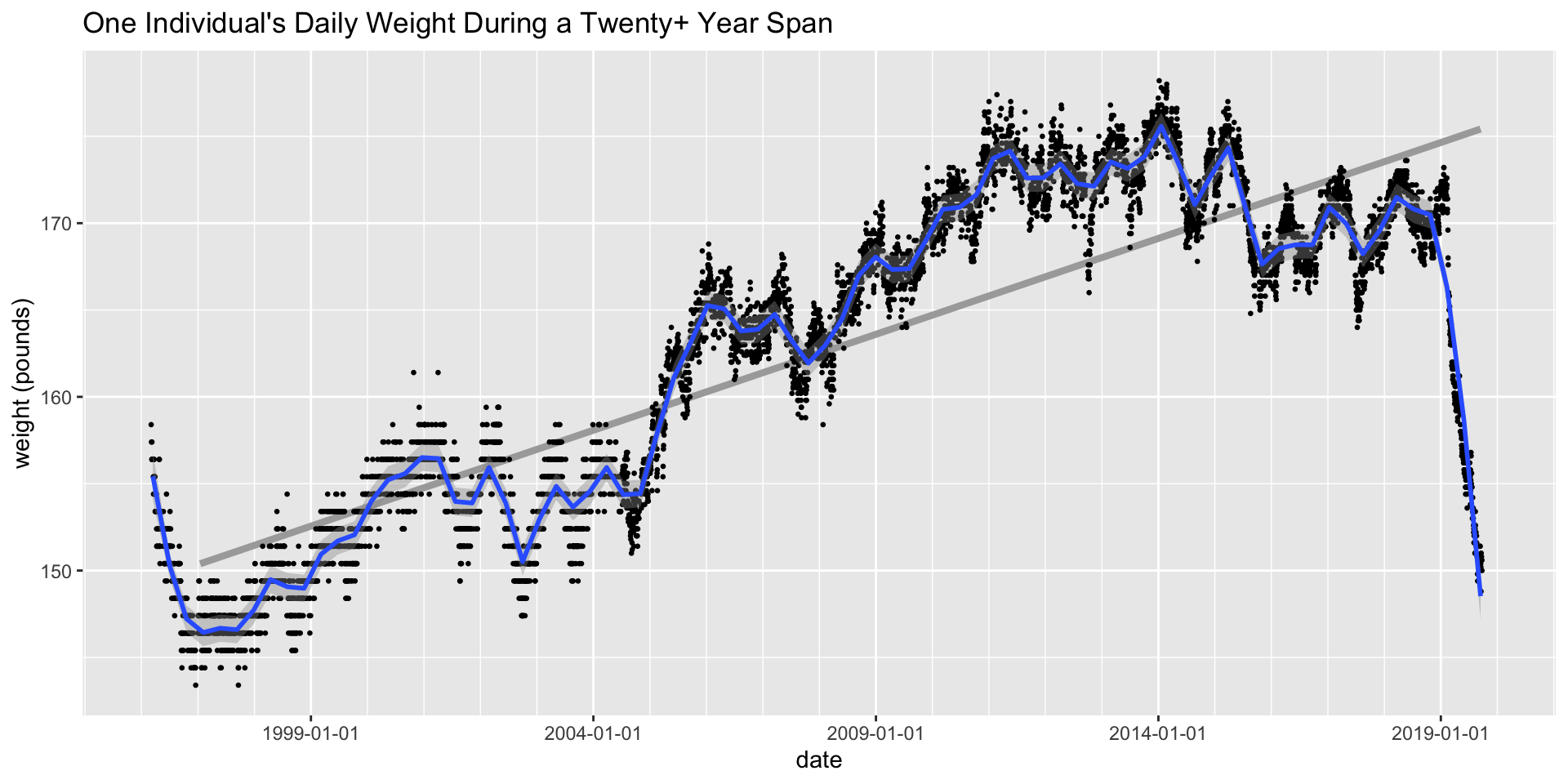
Change in the Trend
I have revised this post because there is a remarkable change in my weight. I won’t go into the full circumstances, but I started to deliberately try to lose weight after a minor medical issue. I used a calorie counting app called Lose It. As demonstrated by this post, I have an appetite for recording data about myself, so Lose It fit my style well. I don’t feel I made any drastic changes in my eating habits, but the fact that I recorded the calories consumed at each meal affected how much I ate at the margin. I was less likely to have seconds, less likely to have a high calorie snack, and so on. For example all through this process I continued to frequently have an evening dish of soy ice cream. The difference is now I put a mug (rather than a bowel) on the kitchen scale as I’m scooping out my serving of ice cream. I aimed to lose about a pound a week, and ended up losing a bit less than that. The result is that my weight is down to where it was in my 40’s. I didn’t feel particularly overweight before, but I feel a bit better after losing the weight.
Seasonal Variation in Weight
In the chart above showing my daily weight, I adjusted the “span” argument to geom_smooth so that the smoothed curve shows seasonal patterns fairly clearly. (If the span parameter were smaller, I would get more bouncing around within years. If it were larger, the curve would emphasize multi-year trends.)
First I will redo the chart in a way that emphasizes the pattern within years.
wtm$year <- year(wtm$mid_month)
weight_data$year <- year(weight_data$mid_month)
weight_data$month_with_fraction <- month(weight_data$mid_month) + ((day(weight_data$date) - day(weight_data$mid_month)) / 31)
pmonth <- ggplot(data = wtm,
                                 aes(x = month(mid_month), y = weight))
pmonth <- pmonth + geom_point(data =
                                                                subset(weight_data,
                                                                             !is.na(weight)),
                                                            size = 0.05,
                                                            aes(x = month_with_fraction)) +
    facet_wrap(~year, nrow = 1) +
    geom_smooth(na.rm = TRUE, se = FALSE) +
  scale_x_continuous(breaks = seq(1, 12, 4),
                                     minor_breaks = seq(1, 12, 1)) +
  ggtitle("Weight by Year") + ylab("Weight") + xlab("Month")
plot(pmonth)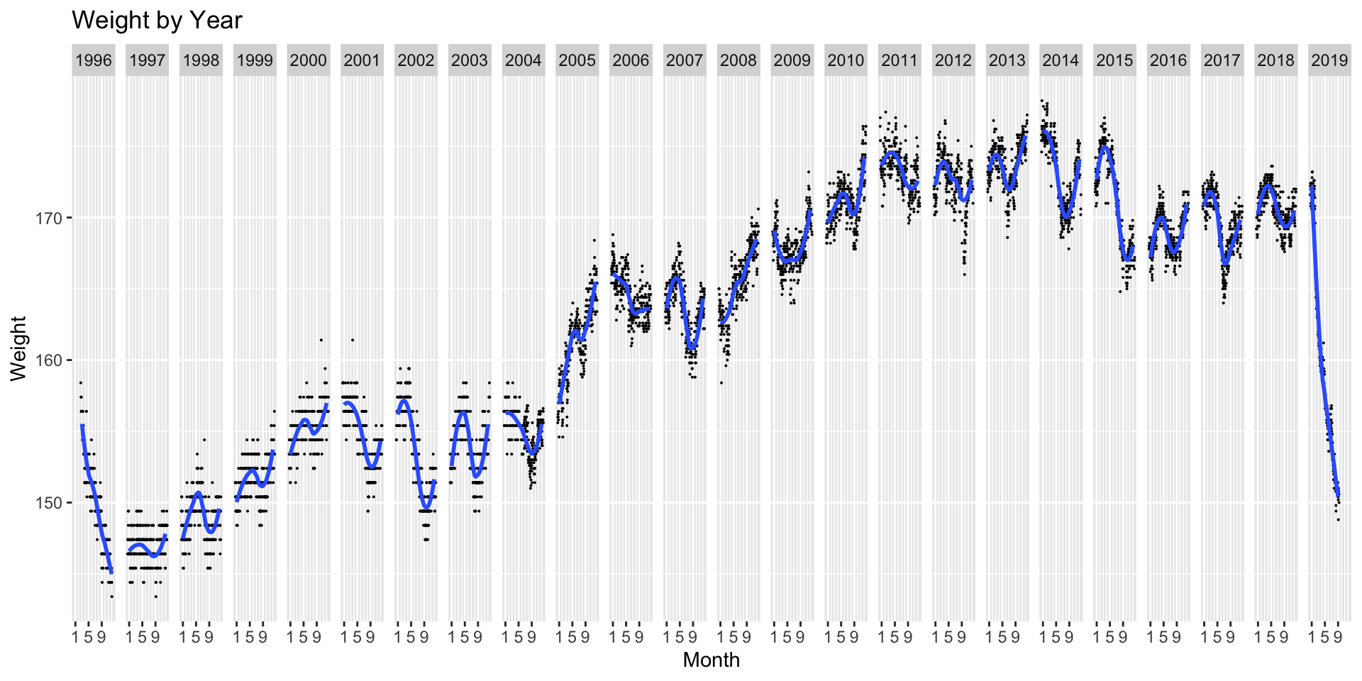
You can see that for most years there is an N shaped pattern. In January weight is still headed up and reaches its peak later in the winter. The trough happens at the end of the summer. It starts back up and continues higher through the end of the year. Basically it is high in early spring and low in early fall. It shows up as an N in this chart because the annual boundary between January and December interrupts the pattern.
I would guess that seasonal adjustment would be a big topic in econometrics. I don’t know much about that. But of course there is an R package called seasonal and another package called season. I looked at season quickly. Neither package seemed helpful in my immediate case, so I went back to something more basic.
Looking at the previous figure, some years do not seem to fit the usual seasonal pattern. I decided to remove years 2005, 2006, and 2008. That’s a bit arbitrary, but probably harmless. For the remaining years, I calculated the mean weight for each month and then subtracted the overall mean for the corresponding year. In other words, I looked at the difference between month average and annual average.
Next I plotted the monthly variation from the annual mean.
year_average <- wtm2 %>% mutate(year = year(mid_month)) %>% group_by(year) %>%
    summarise(year_avg = mean(weight, na.rm = TRUE)) %>%
    select(year, year_avg)
month_differential <- wtm2 %>% mutate(year = year(mid_month)) %>%
  filter(!(year %in% c(2005, 2006, 2008))) %>%
  left_join(year_average, by = c("year")) %>%
    mutate(dif = weight - year_avg)
print(names(month_differential))
## [1] "mid_month" "month"     "weight"    "year"      "year_avg"  "dif"
p <- ggplot(data = month_differential, aes(x = month, y = dif))
# p <- p + geom_line(aes(group = year), colour = "lightgray")
p <- p + geom_point() +
    labs(y = "Difference from Annual Mean",
             x = "",
             title = "Monthly Variation from Annual Mean")
p <- p + geom_smooth(aes(x = as.numeric(month)))
p <- p + scale_y_continuous(breaks = seq(-4, 4, 2))
plot(p)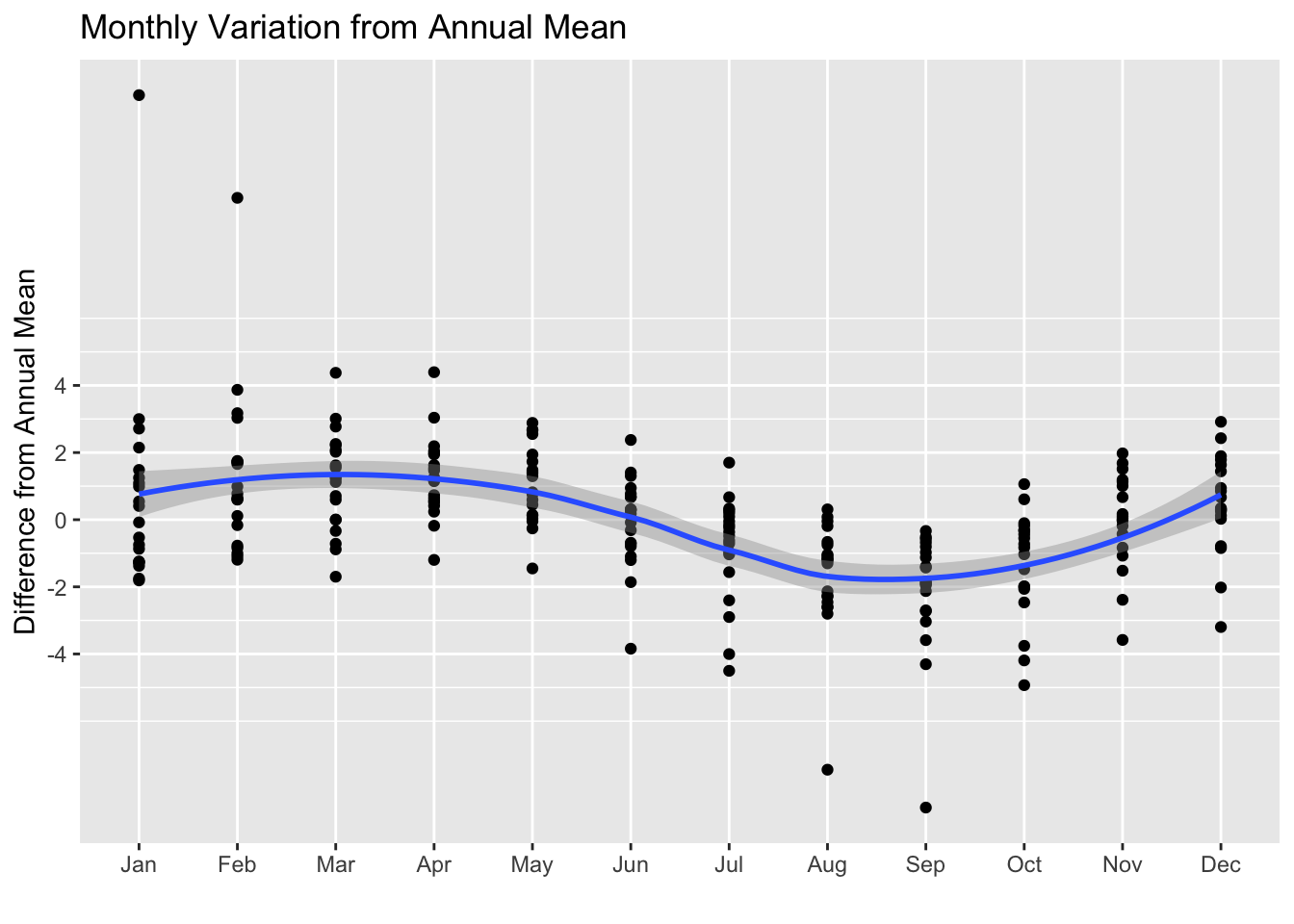
The moral of this story from my point of view is that I should pay attention to the seasonal variation when I am ready to be complacent because my weight seems to be going down in August. As I write this, it is the beginning of March. My weight has been creeping up. I should watch what I eat because I have a couple of months to go of potential seasonal increase in weight.
Note that because the plot runs from January to December, it makes it hard to notice that the mean differential in January is lower than either December or February. There’s an odd dip in January. I don’t have an explanation for this. Perhaps it’s more of a story of December be anomalously high than of January being anomalously low. But this is a minor detail.
Weight Gain by Year
Am I getting heavier? That is a question that has popped into my head from time to time over the years, especially after I increased the waist size for my pants.
For a somewhat glib discussion of weight gain by year, see Wonkblog Look at how much weight you are going to gain. The article says the expected gain is between 0.5 and 1.5 pounds per year. The straight dark gray line on my weight chart is the regression line through the monthly data, but without the bit at the left end in 1996. The slope is about 1.4 pounds per year.
National Statistics on Weight by Age
What do we know about weight by age in the general population? One source is the National Health and Nutrition Examination Survey or NHANES. (There is a summary report for Anthropometric Reference Data that includes weight.) That is the source for the Wonkblog referred to above. It also seems to be the source for these charts (for white women and men) which were compiled at Dr. Halls website, which does not exactly reek of credibility.

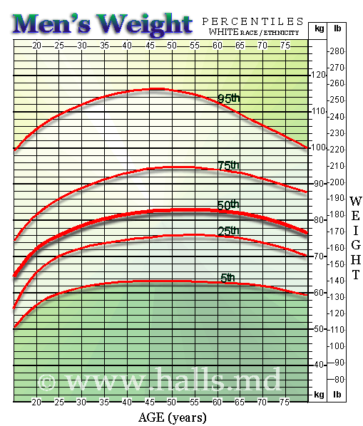 For white males, it shows weight peeking between 50 and 55 and then beginning to decline with age. Maybe. I was born in 1950 so I turned 55 in 2005. My personal peek seems to have been in the vicinity of 62. Maybe my slightly lower weight during the last two years is just another side effect of growing older. But it’s a bit problematic to use cross-sectional data like this as a longitudinal norm. We hear a lot about “the obesity epidemic” so maybe the 55-year old people in this chart will keep going up or stay the same as they get older. Maybe the peek is near 55 as a result of the “obesity epidemic” moving through the age distribution. I don’t know. The turndown after the peak may be only indirectly related to age. Almost any illness or medical problem is increases with age. Maybe age leads to illness and illness leads to weight loss. In my case, illness is not a factor.
The CDC NHANES survey seems to be done annually so it would be possible to look at the change in the distribution over time. They have data sets for the National Health and Nutrition Examination Survey year by year from 1999 to 2013.
I confess I’m not sufficiently interested in the issue of weight and age to dig in and try to get all that sorted out. Maybe I’ll come back to this. Were I to get interested, there is quite a bit of raw data available from NHANES for download as XPT files, which I see is the SAS data transport format. As usual, Hadley is one step ahead of me and the latest version of haven 1.0.0.9 (which is not yet up on CRAN) adds read_xpt as a command to read XPT SAS transport datasets. Maybe I’ll try that at some point, but in the meantime I want to press ahead with my more self-centered (or should I say narcissistic) exploration of my personal body statistics.
Is this Creepy?
I don’t think I am revealing any deep personal secrets by posting this data. On the other hand, it does seem a little weird. A couple of years after I started recording my weight every morning I read Travels With My Aunt, a very funny Graham Greene novel. Toward the end of the book the protagonist encounters a middle-aged CIA agent who does seem a bit creepy. And he also has become focused on self-measurement:
“I’ve never told anyone about this, Henry,” he said. “It would seem kind of funny to most people, I guess. The fact is I count while I’m pissing and then I write down how long I’ve taken and what time it is. Do you realize we spend more than one whole day a year pissing?”
“Good heavens,” I said.
“I can prove it, Henry. Look here.” He opened his notebook and showed me a page. His writing went something like this:
July 28
7.15 0.41
10.45 0.37
12.30 0.50
13.15 0.32
13.40 0.50[some detailed, and creepy, discussion of the details of the results appears here.]
“Are you drawing any conclusions?” I asked,
“That’s not my job,” he said. “I’m no expert. I just report the facts and any data–like the gins and the weather–that seem to have a bearing. It’s for others to drawthe conclusions.”
“Who are the others?”
“Well, I thought when I had completed six months’ research I’d get in touch with a urinary specialist You don’t know what he mightn’t be able to read into these figures. Those guys deal all the time with the sick. It’s important to them to know what happens in the case of an average fellow.”
Travels With My Aunt. Graham Greene. Penguin Classics. Graham Greene Centennial Edition, pp. 190-191.
I have often thought of this passage as I wrote down my weight each morning, recognizing I was doing something a bit odd. As I was composing this post, I went to the library and fetched a copy of Travels with My Aunt and paged through it to find these lines. It was just as odd as I remembered it.
So am I drawing any conclusions from my data? In part I agree with the CIA agent. I’m just collecting raw data. Sometimes, like Graham Green’s character, I imagine handing it off to some medical specialist who could make something out of it. Maybe. Or maybe not.